

Our members list new acquisitions and recently cataloged items almost every day of the year. Below, you'll find a few highlights from these recent additions...
The Goldfinch (Signed First Edition)
by Donna Tartt

First Edition/First Printing with the complete number line; A Fine book in a Fine dust jacket with only slight rubbing to the spine ends, else as new and unread. SIGNED by the author on the 2nd free page underneath a print of the famous painting. A superlative copy of this Pulitzer Prize winning novel (Pulitzer sticker to front cover). Not remaindered, not price-clipped, not ex-library; in a protective Mylar cover and will ship in a sturdy box.
Offered by Grayshelf Books.
THE DIARY OF ANAÏS NIN, 1931-1955
by Nin, Anaïs

New York: Harcourt Brace Jovanovich, 1974. Wraps. Very good. Boxed set of the first five volumes of Anaïs Nin's celebrated diaries, along with a photographic supplement. The first four volumes are inscribed by Anaïs Nin to Charlotte Hyde on the front flyleaf. It was Hyde, a tourism representative for Tahiti, New Caledonia, and the Hebrides, who helped Nin fulfill her lifelong dream of visiting Bali.
Born in France to Cuban parents, Anaïs Nin (1903-77) began keeping a diary at the age of eleven and continued the practice for the rest of her life. Confessional, scandalous, and thoroughly absorbing, her diaries became one of the most celebrated literary projects of the 20th century. Writing candidly of her marriages and affairs – including those with psychoanalyst Otto Rank and author Henry Miller – Nin presents a passionate and detailed record of a modern woman’s journey of self discovery.
Edited by Gunther Stuhlmann. Octavo, six volumes: various paginations. Original pictorial paper wrappers. Some creasing to the spine of the first volume, with a bit of mild toning and wear along the extremities; otherwise very good. Housed in the publisher's slipcase, which is a bit smudged on the top edge.
Offered by johnson rare books & archives.
[Playbill]: The Producers (Signed by Susan Stroman)

2001. Softcover. Near Fine. Playbill. Small octavo. Stapled wrappers. Near fine with small vertical printer's crease on the front cover. A playbill for the 2001 production of *The Producers* featuring Nathan Lane and Matthew Broderick and is Signed on the cover by director and choreographer Susan Stroman, who won a Tony Award in both categories. This copy includes a slip laid in noting that production will be collecting donations for World Trade Center emergency personnel, volunteer and family members of those affected.
Offered by Between the Covers Rare Books.
by Ellison, Ralph

New York: Random House, 1999. First Edition, First Printing. Hardcover. Near fine/very good. Signed by Nobel Prize-winning author Toni Morrison, the first edition of Juneteenth by Ralph Ellison.. Octavo, xxiii, [2], 368pp. Green hardcover, title in gilt on black spine. Stated "First Edition" on copyright page with the publisher's full number line. Solid text block, faint dust remnants to top edge, a near fine example. In the publisher's dust jacket, light shelf wear, a very good copy. Signed by Toni Morrison on the front free endpaper. Morrison's review is printed on the front flap of the dust jacket, where she calls the novel: "A majestic narrativeconcept." Juneteenth, Ralph Ellison's second novel, was published posthumously. It was assembled from countless notes left by Ellison upon his death in 1994. He is best remembered for his first novel, Invisible Man, which won the National Book Award for Fiction in 1953.
Offered by First Edition Rare Books.
Solstice and Other Poems by Jeffers, Robinson

New York: Random House, 1935. 8vo, 151 pp. Green cloth, backstrip sunned, lacking dust jacket. Bookplate of Georgianna Owen Moore. First trade edition.
"Solstice and Other Poems represents a crucial turn in the career—or ministry—of Robinson Jeffers. The title narrative Solstice is the one of Jeffers’ shorter narrative poems. In spite of its brevity, Robinson Jeffers chose not to include Solstice in his Selected Poetry (1938)... The volume did include the previously published lyrics Return and also introduced some noteworthy lyrics, including Love the Wild Swan, Distant Rainfall, Gray Weather, and Ave Caesar." The Inhumanist. Broomfield A20b.
Offered by John WIndle Bookseller.
Die-Cut Advertising Card for Typewriters

United States, 1880. Very good. Light soiling to verso. A handsome advertising card for the Smith Premier Typewriter, die-cut in the shape of the product it advertises. On the back is a printed advertisement for "Mrs. A.L. Whisler, Private Instructor of Shorthand, Typewriting, Business Correspondence" of Cleveland, Ohio. Diecut and chromolithographed, measuring approx. 3" by 4" Although there are many advertising pieces die-cut in shapes during this period, there are only a small number that depict the actual product they are advertising.
Offered by Eclectibles.
by [BRITISH EAST INDIA COMPANY] - John CANNING (c. 1756-1804) and Capt. Michael HOGAN (1766-1833)

1796. The archive comprises: 1.) Autograph letter signed "John Canning." Bifolium (13 x 8 1/4 inches), 21 lines in fine Malay (Jawi) with Arabic opening formula, docketed "Calcutta 10 Dec 1796"; octagonal red-wax armorial seal of the Canning family. Letter requests that local rulers receive Capt. Hogan "as our agent... to conclude a treaty advantageous to both sides," dated 22 Jumada II 1211 / 10 Dec 1796. 2.) to 5.) [4] Paper wrappers. English addresses in a copperplate hand & parallel Jawi headings, each with intact Canning seal. Addressed to the Sultan of Magindanao, King of Mempawah (Borneo), King of Bali, Sultan of Borneo. 6.) to 8.) [3] Yellow-silk diplomatic covers. Golden satin sleeves with paper address bands in two languages; two remain unopened and sealed. Addressed to the Sultan of Johor (unopened), King of Sambawa (unopened), Sultan of Soloo (wrapper only). An exceptional archive, uniting British, Malay, and Islamic manuscript traditions, that captures the East India Company’s first concerted overtures to the island states of Southeast Asia.
Drafted in the wake of the Dutch East India Company's collapse and the French Revolutionary Wars, this archive documents the East India Company's first concerted diplomatic overtures to the maritime courts of the Malay world. With Dutch control unraveling after the 1795 Batavian Revolution, Britain saw a strategic opportunity to enter the lucrative Spice Island trade. Lacking on-the-ground alliances, the Company turned to private initiative: Captain Michael Hogan, an Irish-American merchant and former convict transport captain, was enlisted as unofficial envoy aboard his ship Marquis Cornwallis. The diplomatic texts were composed by Captain John Goodall Canning, then Harbour-Master of the port, in refined court Malay using Jawi script, the Islamic-inflected lingua franca of diplomacy from Aceh to Sulu. In keeping with regional tradition, the letters open with Islamic invocation and florid honorifics, followed by carefully phrased expressions of friendship and commercial intent. The surviving autograph letter fixes the date of the mission and declares its purpose: "to plant affection and concord, and if Your Highness deem it good, to enter with us into a compact benefitting both realms." After disembarking convicts in Port Jackson (Sydney) in February 1796, the Marquis Cornwallis passed northward through Torres Strait, calling at New Guinea, the Moluccas, and ports across the Java Sea, almost certainly delivering these and parallel documents en route. The silk wrappers signal the elevated diplomatic status of the messages, which were meant to be presented in person by Hogan and opened only in the presence of the addressee. The present archive offers a rare and vivid glimpse into the hybrid ceremonial, linguistic, and political world of early modern Southeast Asia, and into the improvisational diplomacy of the Company at the edge of empire.
Offered by Donald A. Heald Rare Books.
by Rex Stout

New York: The Viking Press, 1957. Very Good+/Very Good-. New York: The Viking Press, 1957. First Edition. Octavo (21 cm); 186pp. Boards in light blue cloth with blue stamping, wrapped in intact publisher's jacket ($2.95). Yellow top stain. Jacket lightly soiled with scuffing, creasing and rubbing overall with light sunning to spine. Board corners and spine ends bumped with minor discoloration to spine. Offsetting at endsheets, otherwise pages clean. A Very Good or better copy in a Very Good jacket
Offered by Capitol Hill Books.
by Joyce, James

New York: Random House, 1934. First American Edition. Very Good+/Very Good+. First American edition, first printing. Bound in publisher's original cream-colored cloth lettered in black and red. Very Good+. CLoth with toning to spine and edges, light wear to front joint. Former owner name to front free endpaper and contents tanned. In a Very Good+ unclipped dust jacket with designer's name Reichl to bottom corner of front panel, with tanning and edge wear, several small splits at the joints with a mending tissue repair made to the verso of the rear spine joint. A nice copy of the once banned novel.
Offered by Burnside Rare Books.
Early Black Superhero "Rapport" in Secret Six Comics, 1968-69

Archive of six issues of Secret Six, Nos. 1–6 (DC Comics, 1968–1969), featuring an early African American hero in a mainstream ensemble title. Six issues, in original color pictorial wrappers. Printed by National Periodical Publications (DC Comics). Complete run of the original 1968–1969 Secret Six series, illustrated by Jack Sparling and scripted by E. Nelson Bridwell and Joe Gill. Edited by Dick Giordano. Printed in full color.
A key ensemble series in DC’s late Silver Age experimentation, Secret Six remains notable for its unusually diverse cast, subversive tone, and for introducing one of the earliest Black protagonists in a mainstream superhero team. The character known as Dr. August Durant (alias “Rapport”) is a critical member of the covert six-person task force led by the mysterious “Mockingbird.” A skilled African American surgeon and operative, Durant was a rare example of non-stereotyped Black heroism in 1960s comics—a field that otherwise offered minimal space for serious, complex representations of Black identity. Although his race was not a constant focal point, Durant’s presence in the group predated the arrival of better-known Black superheroes like Marvel’s Falcon (1969) and Luke Cage (1972), making his inclusion historically significant. Archive includes:
[1] Secret Six No. 1 (Apr.–May 1968), “Code Name: Mockingbird,” introduces the team and the central dilemma—each member’s dark secret is known to Mockingbird, who uses that knowledge to manipulate them.
[2] Secret Six No. 2 (June–July 1968), with a plot involving Cold War sabotage and a fictional nuclear bomber, the XB-107.
[3] Secret Six No. 3 (Aug.–Sept. 1968), deepens the interpersonal drama, highlighting the internal fractures in the team.
[4] Secret Six No. 4 (Oct.–Nov. 1968), “Escape for an Enemy,” centers a mission to rescue a disgraced Chinese general, featuring coded racial tropes typical of Cold War fiction, with Durant emerging as a moral counterpoint.
[5] Secret Six No. 5 (Dec. 1968–Jan. 1969), “The Queen Without a Crown,” a heist storyline involving the Crown Jewels of a fictional European country.
[6] Secret Six No. 6 (Feb.–Mar. 1969), “The Victim is a Killer,” closes the series with a noir-inflected assassination mystery.
The Secret Six series was notable for its relatively progressive narrative structure, its commitment to moral ambiguity, and its break from traditional superhero conventions. While Durant did not become a breakout solo character, his role within the series laid groundwork for later ensemble-based inclusivity in mainstream comics and offers critical insight into DC’s transitional publishing era. Moderate wear consistent with age. Overall very good condition. An uncommon run that features one of the earliest Black heroes in a sustained team role in mainstream comics—preceding broader Black representation in the genre by several years.
Offered by Max Rambod, Inc.
Frankenstein, or The Modern Prometheus
by Shelley, Mary Wollstonecraft; Lynd Ward

New York: Harrison Smith and Robert Haas, 1934. First trade edition. Hardcover. Very Good. Lynd Ward. 259pp. Octavo [24 cm] Blue cloth over boards with wraparound illustration. The spine is a touch rolled, and the boards are mildly warped. The spine is sunned. The edges of the boards are rubbed. Toned adhesive remnant, likely from a bookplate, on the front pastedown. Lacks slipcase. Dance 064. Includes fifteen full-page illustrations by Lynd Ward, plus illustrations scattered throughout. This is Lynd Ward at the height of his powers, and this gothic novel may be the perfect avenue for his work.
Offered by Ken Sanders Bookseller.
The General Laws of the State of California, From 1850 to 1864
by Hittell, Theodore Henry; Parker, Charles

1865. San Francisco: H.H. Bancroft, 1865. 2 vols.. San Francisco: H.H. Bancroft, 1865. 2 vols. From the Library of San Francisco Attorney Emanuel S. Heller the Founding Partner of the Law Firm of Heller Erhman Hittell, Theodore Henry, Compiler. Parker, Charles, Compiler. The General Laws of the State of California, From 1850 to 1864, Inclusive: Being a Compilation of All Acts of a General Nature Now in Force, With Full References to Repealed Acts, Special and Local Legislation, And Statutory Constructions of the Supreme Court. To Which are Prefixed the Declaration of independence, Constitution of the United States, Treaty of Guadalupe Hidalgo, Proclamations to the People of California, Constitution of the State of California, Act of Admission, And United States Naturalization Laws, With Notes of California Decisions Thereon. San Francisco: H.H. Bancroft and Company, 1865. 2 volumes. Quarto (10" x 7"). Contemporary sheep, blind frames to boards, with red and black lettering pieces to spine. Worn and soiled. Joints cracked, but holding. Rubbing to boards, corners bumped and worn. Ex-library with property stamp to front pastedown of volume one. Previous owner's contemporary signature to front free endpaper of volume one. Light toning, offsetting to margins of endleaves, wear to edges of some leaves, internally clean.
Only edition. The first compilation of California laws was issued in 1853, three years after the state's admission to the Union. The second, organized by topic followed in 1857. Hittell and Parker's compilation, a more extensive and sophisticated work, was the third. This set belonged to Emanuel S. Heller, a notable member of the California Bar and the founder of the important San Francisco firm Heller, Ehrman, White & McAuliffe. Babbitt, Hand-List of Legislative Sessions and Session Laws 24.
Offered by Lawbook Exchange.
by [Fore-edge Painting] ROGERS, Samuel (1863-1855).

London:: Printed for T. Cadell; and E. Moxon, 18030, 1834., 1803. 2 volumes. 8vo. ITALY: vii, 284 pp. POEMS: vii, 284 pp. Engravings throughout. Bound ca. 1890/1905 in full olive brown crushed morocco, gilt corner decorations, dentelles, a.e.g., marbled endleaves. Bookplates of Alfred Trapnell and Oscar Ehrhardt Lancaster (both owned fore-edge paintings). ITALY: p. 273/4 torn and mended. ITALY has only the Trapnell bookplate, as the books had been separated for many years in the past. Very good. Each volume with a vertical fore-edge painting of a large porcelain urn or vase with a plant. The painting is not signed or dated – the evidence of ownership (Trapnell) suggests these two paintings were made before 1910.
PROVENANCE: Alfred Trapnell bookplate, his library sold in NY ca. 1910 ["997" + "998" label]. The fore-edge was painted before Trapnell bought (possibly as a commission from him) the book. The ITALY was from the Phoebe Jane Easton collection of fore-edge paintings (Jeff Weber bought), a clear companion to the other volume, also with Trapnell's bookplate. Alfred Trapnell was a famous collector of porcelains. Unstated Provenance: Matt Wyse. LANCASTER did not have both of these volumes, his bookplate appears only in the one book. It was Matt Wyze who bought the stray volume and then I recognized it and married the two back together again – probably apart for more than 30 or 40 years. ITALY: From the Phoebe Easton collection of fore-edge paintings.
SIDE NOTE: Professor Carl J. Weber visited Lancaster on May 1, 1954 and inscribed a copy of his book [1001 Fore-edge Paintings, Waterville, 1949] on fore-edge painting to him. Lancaster (b.1887) who was a patent lawyer from Pennsylvania, also a book collector and had a collection of fore-edge paintings. See: Frederick Litchfield, Albert Amor. The Trapnell collection. An appreciation. ca.1912. (19 pp.); An Illustrated Catalogue of Chinese Porcelain and Pottery, Forming the Collection of Mr. Alfred Trapnell. Bristol, 1901.
Offered by Jeff Weber Rare Books.
Original program for United States I-IV; with: first edition of United States
by Anderson, Laurie

Chicago: Museum of Contemporary Art, 1982. Original program for an early Chicago performance of selections from Laurie Anderson’s United States I-IV, her eight-hour multimedia performance piece on “life in the nuclear technocracy” which would first be performed in its entirety the following year at the Brooklyn Academy of Music. United States I-IV included some of Anderson’s most enduring contributions as an artist: her innovative use of the vocoder and her own invention, the “tape-bow;” her fascination with written and spoken language; and the surprise hit single “O Superman.” The Chicago program is accompanied by two original handouts from that performance and a first edition of Anderson’s subsequent book, United States, published by Harper & Row in 1984. Fine examples. Single bifolium, measuring 11 x 8.5 inches: [4]. Text printed in red over images of Anderson printed in silver. Photocopied notes on the performers for May 19-20 and flyer for the New Music America ‘82 Festival laid in. With: oblong volume, measuring 8.5 x 11 inches: [232]. Original color pictorial wrappers, illustrated with photographs throughout text. Lightest edgewear.
Offered by Honey & Wax Booksellers.

Natemoonlife, 2021. 401/930 copies. VG+. Color silkscreen, measure 18" x 24" A Tour 2021 poster created for the DTE Energy Music Theatre show in Clarkson, MI held on Sept. 10, 2021. From the collection of Bill Walton with a small ink stamp on the reverse indicating as such.
Offered by Mullen Books.
Where the Stress Falls: Essays [Signed]
by SONTAG, Susan

New York: Farrar, Straus and Giroux, 2001. First Edition. Octavo (23.5cm); dark green cloth spine over black paper-covered boards, with titling stamped in white on spine, and author's initials stamped in black on front cover; dustjacket; 351pp. Signed by author on title page. A Fine copy. Dustwrapper, designed by Susan Mitchell, unclipped (priced $27.00), with sticker to verso of front panel, else Near Fine. Collection of essays, organized into "Reading", "Seeing", and "There and Here", and includes "A Poet's Prose", "A Place for Fantasy", and "Waiting for Godot in Sarajevo".
Offered by Lorne Bair Rare Books.
Teacher's Guide: "A Hard Day's Night"
by {THE BEATLES} ALLEN, THOMAS P.

New York: United Artists Corporation / The Center for Understanding Media, Inc.. Fine. (ca.1972). First Edition. Softcover. [as new, with no discernible wear of any kind]. (B&W photo cover)
An uncommon piece of Beatles-related ephemera, consisting of four mimeographed pages (text on one side only), fastened together with a single staple, inside a printed folder with a photo of the Fab Four on the cover. This was issued under the banner of UA:16, the non-theatrical (16mm) distribution arm of United Artists, to assist high school teachers who wanted to use The Beatles' 1964 debut feature film as part of their classroom curricula (these teachers would have to have been quite a few degrees cooler than any high school teacher I ever had, with the exception of Mr. Patrick Burns).
Its contents are organized under four headings -- The Origin of the Film; The Filmmakers and Their Format; The Attitude of the Film; Suggestions for Usage -- and as might be expected from the imposition of such an overlay onto such an essentially anarchic film, the results (despite their obvious sincerity) are often unintentionally hilarious. One sample: The film, "according to type, may be classified as an entertainment documentary, or as an actuality reenactment, or as all other kinds of contradictory terms. It is unique in its class because it sets out to record the actual face of an entertainment event without losing the distancing effect of cinema artifice." The "Suggestions for Usage" section begins: "A Hard Day's Night is basically an experience. In colleges, it has a validity as a sociological study, but on the high school level it is a chance for a teenager to confront himself and his values. The teenagers presented in the film are actually people, not actors, and as previously described by [Hunter] Davies, 'emotionally, mentally, or sexually excited, foaming at the mouth' etc. Although the film elicited the same reaction, hopefully in the seventies in the classroom it would received a more balanced reaction. The movie itself is an antidote to runaway emotionalism." (NOTE that I have dated this based in part on its inclusion of quotes from Hunter Davies's 1968 biography of The Beatles and Joseph Gelmis's 1970 book "The Film Director as Superstar.").
Offered by ReadInk.

[Warsaw: NP, 1939. Broadside/ Poster. vg. Measuring 20 1/2 x 25 1/2]
This extremely important and scarce historical document officially announces the event that would become the start of the Second World War, which would go on to be among the deadliest conflict in human history. This is known to be the first printed official communication of the Polish government regarding the German invasion, and therefore the very first printed mention of the events initiating WWII. These declarations were officially posted in cities throughout Poland, in the wake of the initial early morning assault by German Naval forces and the Luftwaffe, on September 1st. Although Polish radio had started to broadcast announcements about the invasion as early as 6:30 am, this presidential proclamation was the first in print. This is a copy from Warsaw.
In the text Polish president Ignacy Mościcki announces the German invasion and appeals to the Polish citizenry to the take arms to defend their freedom and independence. The text blesses the Polish people and asks them to stand united with the army, promising a strong and victorious military response.
Proclamation is in very good condition, with only some minor foxing at stains towards the bottom and right side, as well as some light creasing and closed tears along the right edge. Folding creases. All text clean and vibrant. In overall very good condition. These printed proclamations (posters) are now extremely scarce with only one known institutional holding known, located in the National LIbrary of Poland. (
Offered by Eric Chaim Kline Bookseller.
THIS IS ANN : She's Dying to Meet You
by [Seuss, Dr.]; [Leaf, Munro]

(Washington, DC): (Government Printing Office), 1943. Near fine.. First printing of this cheeky safety pamphlet on the dangers of malaria, handed to US troops during WWII. Both Leaf and Seuss were serving in uniform at the time of this pamphlet's creation — and while neither is credited, Seuss's cheerfully bizarre illustrations and Leaf's breezy prose nevertheless betray their distinctive styles. An unusual and highly sought piece of Seuss ephemera, quite evocative of the era. 5.25'' x 4.25''. Original saddle-stapled pictorial wrappers printed in black and red. Illustrated by Seuss in black and red. [32] pages. Faint toning and a bit of spotting, else largely clean. Firm
Offered by Type Punch Matrix.
by (BINDINGS - GÓMEZ-HERRERA). CERVANTES SAAVEDRA, MIGUEL DE

Barcelona: Editorial Seix Barral, 1947. No. 72 OF 150 COPIES on "Gotico" paper (and eight deluxe copies with multiple suites of plates, five artist's copies, and 25 copies with color plates). 332 x 258 mm. (13 x 10"). 85, [1] pp., [3] leaves.
DRAMATIC MODERN MOSAIC MOROCCO BY RAMÓN GÓMEZ-HERRERA (the binder's signature "R. Gomez" in blind at foot of front cover), the covers and spine with a wraparound abstract design in black and olive green morocco "splattered" with onlays of gray, blue, turquoise, vermillion, white, and tan morocco, with two eyes--one on each cover--in black, white, and gray morocco, doublures and endleaves of citron suede, top edge gilt, other edges untrimmed. In a suede-lined emerald green morocco dust jacket with the title embossed on the (slightly sunned and minimally scuffed) spine, the whole in a matching green morocco and citron suede slipcase. With eight lithographs by Francisco Domingo. Front flyleaf with ex-libris of Madrid bibliophile Maurice J. Lachard. For the binding: "Ramón Gómez-Herrera, Maestro de la Luz y el Color" (Catalogue for the exhibition "Color a flor de piel," 2004), p. 138 (http://www.aquiseencuaderna.com/pdf/ramongomez.pdf). See: Johnston, "Generic Polyphony and the Reader's Exemplary Experience in Cervantes' Rinconete y Cortadillo," in "Revista Canadiense de Estudios Hispánicos," Vol. 16, No. 1 (Otoño 1991), pp. 73-85. A PRISTINE COPY.
This bibliophile's edition of Cervantes' satirical short story comes covered in a design both ferocious and haunting, executed by the modern Spanish master of mosaic leather bookbinding. Described by fellow bookbinder Carlos Rey as "the maestro of light and color," Ramón Gómez-Herrera (1938-2017) studied bookbinding with César Paumard at the School of Graphic Arts before setting up his workshop in Barcelona in 1962. According to José Luis Checa Cremades' "Diccionario biográfico razonado de los principales encuadernadores españoles de los siglos XX-XXI," Gomez-Herrera approached his craft "with utmost dedication, using leather embossing tools and processes of his own invention that allowed for the most free-flowing figurative designs." He worked with prominent Spanish artists, including Cristóbal Ruiz and Jorge Hernández, to create abstract designs, which he then executed with innovative techniques. As Cremades tells us, "He dispensed with traditional tools, such as the ruler and compass. His symbolic decorations had great individual significance. In his beautiful mosaics, color has its own expressiveness, the design achieves a powerful visual effect, and overcomes the limitations inherent in leather to approximate the tones of the painter's palette." His influences included Kandinsky, Picasso, Futurism, and the Spanish avant-garde. According to a 2004 catalogue for the "Color a flor de piel" exhibition of his work in Cadíz, our binding was done in 1987 for Gomez-Herrera's principal patron, the great Spanish collector Maurice J. Lachard. Other important clients included King Juan Carlos and Queen Sofia of Spain, Queen Fabiola of Belgium, Charles, Prince of Wales, and Fidel Castro. The international accolades he received include the Golden Flower at the 1st Triennale International de la Reliure in Lausanne (1979), second prize in the technical category at the Prix Paul Bonet in Ascona (1985), and first prize in the professional category at the 3rd Biennial of Art Bookbinding in the Basque Country (1995). The text here comes from Cervantes' 1613 collection of 12 tales, "Novelas Exemplares," and recounts the adventures of two petty thieves who make their way from the provinces to Seville, where they encounter that city's grandiose guild of thieves. Much of the tale is devoted to humorous observations on the guild's hierarchy and rituals, which mimic those of grander organizations. Critic Robert Johnston considers it a "polyphonic" tale that combines the genres of picaresque, romance, and the pastoral to create something richer. The austere lithographs convey the sincerity--and even the pathos--of the characters.
Offered by Phillip J. Pirages Rare Books.
by Maguire, Gregory
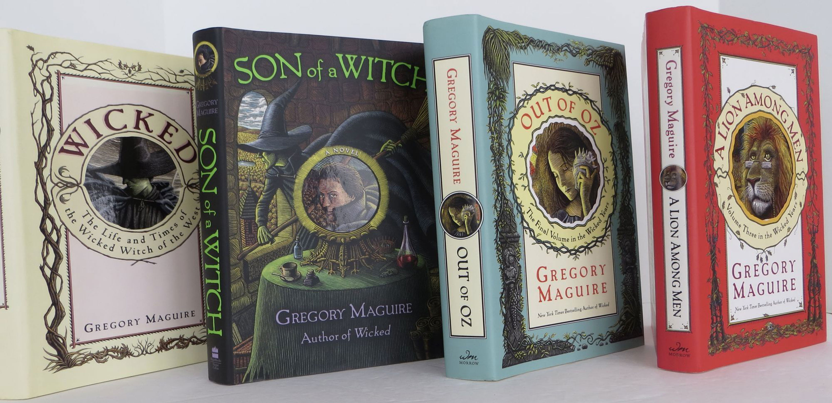
Regan Books/Harper Collins, 2010. first. hardcover. fine/fine. Stated first edition in all four books. All four books SIGNED by author. All books and dust jackets in fine condition. Wicked title is housed in supplied slipcase. Wicked, Son of a Witch, A Lion Among Men, Out of Oz.
Offered by Bookbid.
by Dinesen, Isak
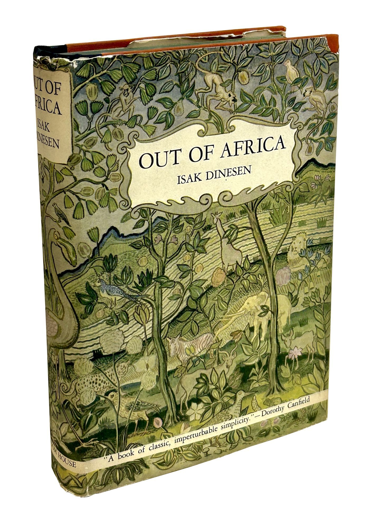
New York: Random House, 1938 First American edition, first printing. Publisher's rust-colored cloth over black spine, stamped in gilt with gilt depiction of a flamingo to front board, top edge stained green; in the original pictorial dust jacket with an illustration of a dense jungle scene. Light dimming to front board gilt, else fine book; very good clipped dust jacket, with shallow chipping to head of spine, light wear to spine ends and panel edges, a shallow chip to top right corner of front panel, and light soiling to rear panel. Overall, a pleasing copy. Out of Africa is the memoir of Danish author Baroness Karen von Blixen-Finecke and is based on the author's experience living in Kenya when it was controlled by the British Empire. The book offers a unique glimpse into colonial life in East Africa. Interestingly, Blixen published the first English edition under her name, but the first American edition under her pen name, Isak Dinesen. In 1985, Out of Africa was adapted into a film of the same name starring Robert Redford and Meryl Streep under the direction of Sydney Pollock.. First American Edition. Hard Cover. Fine/Dust Jacket Included.
Offered by B&B Rare Books.
Yoko at Indica [Unfinished Paintings and Objects]
by ONO, YOKO
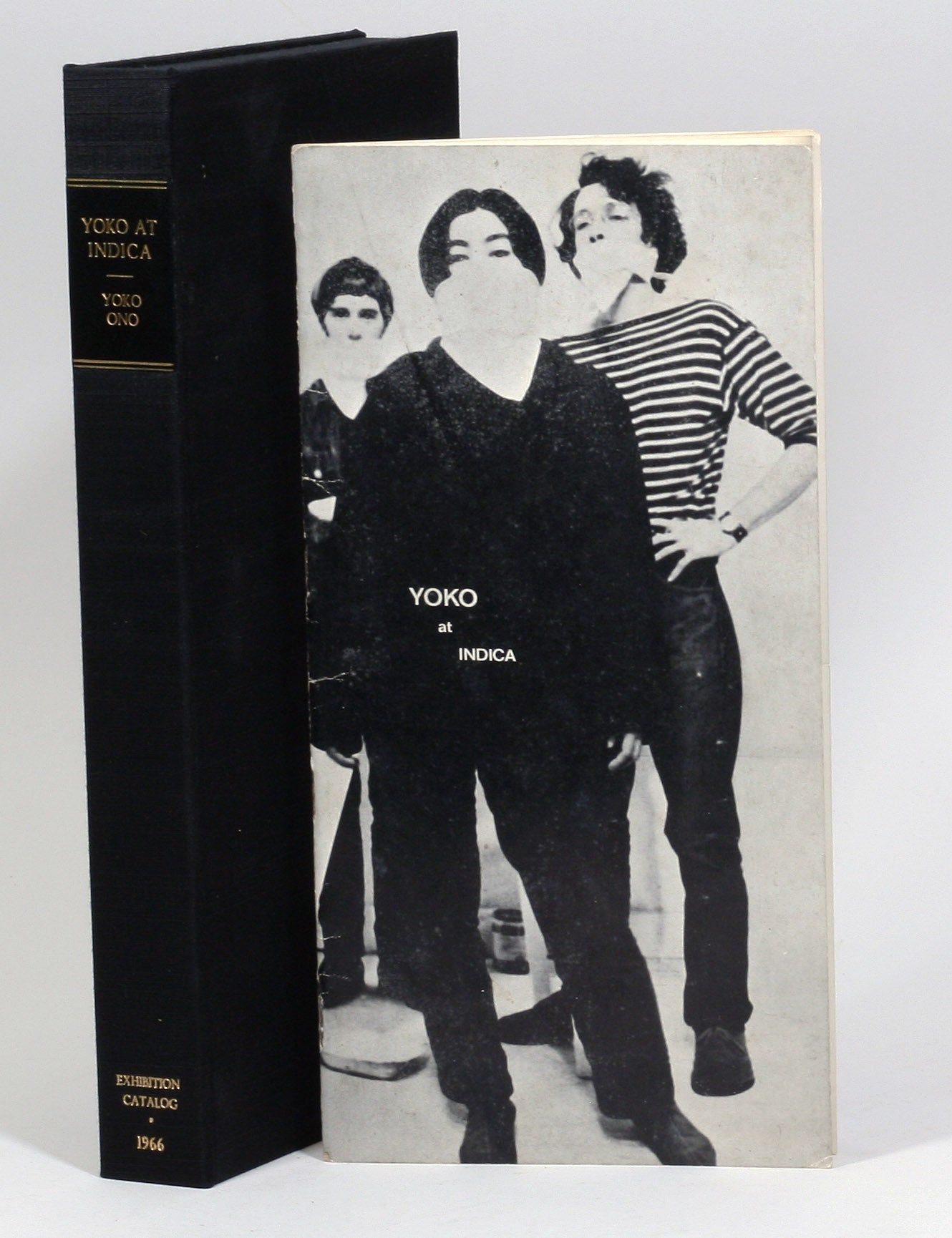
London: Indica Gallery, 1966. First edition. Very Good. The exhibition catalog for Yoko Ono’s transformative one-woman show at London’s Indica Gallery. Famous for the place where she and John Lennon first met. A REMARKABLE SURVIVAL: THE ONLY COPY WE CAN LOCATE WITH ALL THE PHOTOGRAPHS AND SLIPS INTACT. The “Yoko at Indica” catalog is an interactive work of performance art, much like her actual exhibit, held in November 1966. There are eight leaves of black and white images of the exhibits printed on gummed paper, with three images to a page, perforated so each of the 24 images can be removed and pasted onto a half-page slip with the correct caption. The slips were created by splitting the text pages horizontally – the caption slips are on the top, while the bottom slips, moving independently of the top slips, contain vintage Ono sayings, instructions, and “imaginations”, as well as a somewhat humorous sales/price list, a bio (“gave birth to a grapefruit / collected snails, clouds, garbage cans”) and an artist’s statement (“People went on cutting the parts they do not like of me finally there was only the stone remained of me that was in me but they were still not satisfied and wanted to know what it’s like in the stone”).
Some of the pieces exhibited (and illustrated in the catalog) include her famous white chess set (Play It by Trust), Painting To Be Stepped On, Painting To Hammer A Nail, and significantly, Apple, and Ceiling Painting. “Apple” was the piece that first got John Lennon’s attention when he visited the gallery before the opening at the request of the gallery co-owner John Dunbar. The exhibit – an apple on a pedestal – was supposed to decay over the run of the show as a commentary on the cycle of life, impermanence, and deterioration, but Lennon walked up to the apple and started eating it. He then discovered “Ceiling Painting”, where a ladder was placed under a magnifying glass attached to the ceiling. If the visitor – in this case Lennon – climbed the ladder and used the magnifying class, they could view the tiny painting on the ceiling, simply the word “yes”. Lennon was impressed, much more so than with the apple. As he later explained:
“Well, all the so-called avant-garde art at the time and everything that was supposedly interesting was all negative, this smash-the-piano-with-a-hammer, break-the-sculpture boring negative crap. It was all anti-, anti-, anti-. Anti-art, anti-establishment. And just that ‘yes’ made me stay in a gallery full of apples and nails instead of just walking out saying, ‘I’m not gonna buy any of this crap.’” (quoted in Sheff, 62).
Although their relationship didn't begin immediately, the impression each made on the other at the Indica Gallery set the stage for the future.
Interestingly, the catalog notes “production by Anthony Cox.” Cox was Ono’s husband at the time, and soon to be in a very contentious relationship with Lennon and Ono over the dissolution of their marriage and the custody of their daughter Kyoko.
The catalog is often overshadowed by the fact that it marks the place where Ono and Lennon first met, but that does a disservice to the remarkable nature of the catalog itself. With its innovative format and provocative Ono quotes, the catalog is an interactive work of art, inviting the reader to fully participate in the exhibit through the catalog. It is a natural sequel to Ono’s groundbreaking Grapefruit from 1964, and a monument of the Fluxus movement.
London: Indica Gallery, 1966. Size: 5.5x11 in. (14x28 cm). Composed of illustrated card stock wrappers, complete with 8 thin sheets with 3 photographs per sheet (perforated but still all held together) and gummed adhesive on back (but not sticky, thank goodness) for a total of 24 images; 12 interior text sheets split along the horizontal with the top sheets designed for the 24 images (front and back of each sheet) and the bottom with Ono’s text. Housed in custom box. Some light rubbing to covers, a few sheets with just a hint of adhesive offset. An absolutely remarkable survival in such beautiful and complete original condition.
References: Sheff, David. Yoko: A Biography, 2025.
Offered by Manhattan Rare Book Company.
Adventures of Huckleberry Finn (with original artwork)
by Twain, Mark [Samuel L. Clemens]
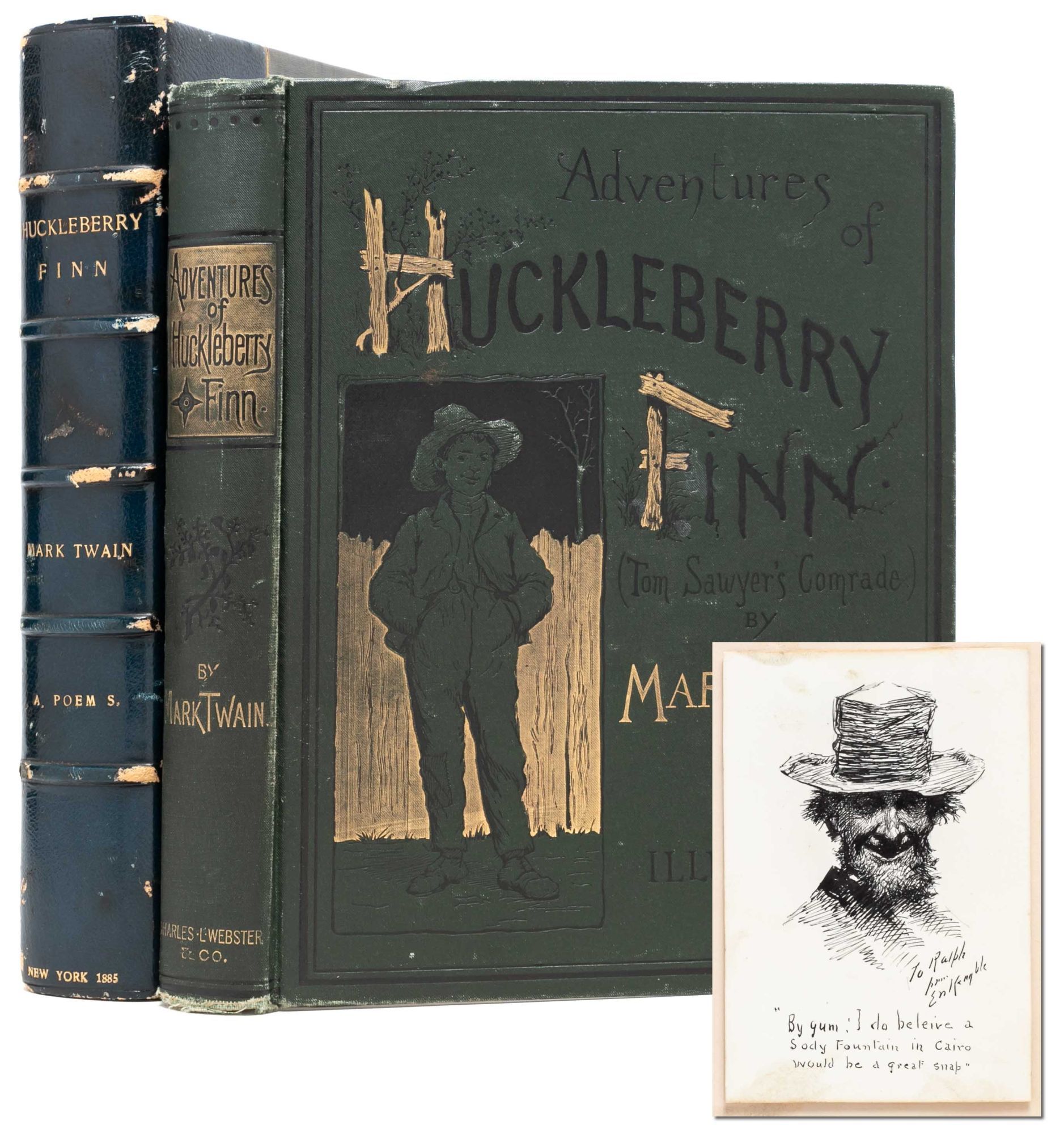
New York: Charles L. Webster and Company, 1885. First American edition. Very Good +. With original sketch by E. W. Kemble, artist of the iconic Huckleberry Finn frontisportrait, tipped onto the verso of the front free endpaper. The sketch is inscribed "To Ralph from E W Kemble" and captioned: "By gum: I do believe a Sody Fountain in Cairo would be a great snap."
A solid, Very Good+ copy of the book, with no repairs or restoration. Wear at the heel of the spine and lower corners, with the cloth worn through or fraying. Internal contents generally clean and fresh. Leather bookplate of Ralph C. Runyan and paper bookplate of K. O. Foltz to front pastedown. Frontis bust in the second state, but with the three main issue points to identify the first printing. Scarce with original artwork from one of the bookseller's key illustrators. Housed in a custom quarter leather slipcase with chemise.
Recounting the adventures of Huckleberry Finn as he flees his own abusive father and aids Jim in his escape from slavery, Twain's novel has been praised for its "distinctly American voice," putting at its center two common people who find an uncommon friendship. "Today perhaps the novel’s greatest significance lies in its conception of childhood, as a time of risk, discovery, and adventure. Huck is no innocent: He lies, steals, smokes, swears, and skips school. He accepts no authority, not from his father or the Widow Douglas or anyone else. And it is the twin images of a perilous, harrowing odyssey of adventure and perfect freedom from all restraints that so many readers find entrancing" (Mintz). A metaphor for a young and rebellious nation, as well as its individualist inhabitants, Huckleberry Finn defies genre by being simultaneously an adventure story, a road novel, a coming of age tale, an expression of nostalgia for the expansive natural spaces lost to industrialization, and an exploration of race and class. Listed on the American Scholar 100 Best American Novels and one of the 100 Best Novels Written in English.
Offered by Whitmore Rare Books.
by C.R. Salmons, D.D.S.
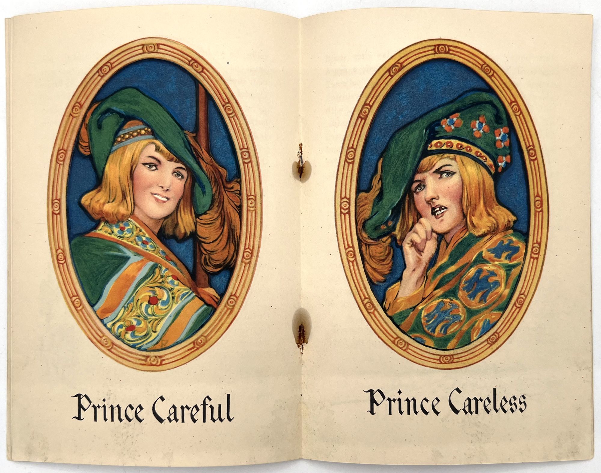
New Haven, Connecticut: The Kolynos Company, 1922. Good. Toning, rust staining from staples with leaves loose as a result.. A 1922 booklet "published in the interest of better mouth hygiene and more intelligent care of the teeth" by The Kolynos Company, manufacturers of tooth paste. The booklet uses typography and illustration to mimic a medieval fairy tale, and tells the story of "Prince Careful" and "Prince Careless". Both have white sentinels guarding their respective castles, but only Prince Careful takes care of his. Prince Careless learns his lesson when enemies infiltrate his castle, and he can only destroy them with Kolynos dental cream and his dentist. Includes in-text illustrations of the story, and illustrations on the upper and lower wrappers of the characters. Includes an amusing center spread of the princes, each in portrait, one smiling with good teeth and the other frowning with bad teeth. Single vol. (7.75" by 5.25"), pp. [16], illus., in original illus. self wrps. Kolynos was founded in 1908, and was eventually absorbed into the Colgate company.
Offered by Eclectibles.
Star Wars Episode III: Revenge of the Sith (Original press kit for the 2005 film)
by George Lucas (director, screenwriter); Ewan McGregor, Natalie Portman, Hayden Christensen, Samuel L. Jackson, Christopher Lee (starring)

Los Angeles: Twentieth Century-Fox / Lucasfilm, 2005. Vintage press kit for the 2005 film. Full-color illustrated pocketed folder, containing two gatherings of promotional reading material, a "digital press kit" on a compact disc, and a fold-out color map.
The sixth film in the wildly successful "Star Wars" series, and the third installment in the prequel trilogy.
Folder, disc, and promotional material Near Fine.
Offered by Royal Books.
by Morris, William
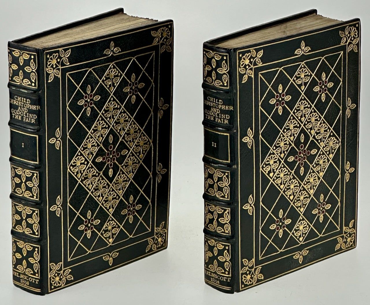
Hammersmith: Kelmscott Press, 1895. First Edition. First Edition. 2 volumes, 12mo, uncut. Hand-colored borders and initials. Printed in Chaucer type in red and black, title page and facing page with full woodcut page border, 7ñline and small woodcut initial capitals. Contemporary dark green morocco elaborately gilt by ALFRED DE SAUTY designed with a gilt all over pattern accentuated with tiny red morocco inlaid dots, spine in six compartments gilt lettered and numbered, top edges gilt. Provenance: William Morris (presentation inscription "To W. Hooper from William Morris"); William Harcourt Hooper (1834-1912, wood-engraver); Asa Foster Lingard (1899-1957, bookplate).
IMPORTANT ASSOCIATION COPY, LIMITED EDITION, one of 600 copies of a total edition of 612, INSCRIBED TO W.H. HOOPER, ENGRAVER OF THE KELMSCOTT CHAUCER. The beautifully executed binding is by Alfred De Sauty (1870-1949) who was the subject of an essay by Marianne Tidcombe entitled "The Mysterious Mr. De Sauty," published in For the Love of the Binding. Studies in Bookbinding History Presented to Mirjam Foot (2000), pp 329-336. She notes that "the first non-trade bookbinder, T. J. Cobden-Sanderson, emerged in the 1880's ... he was followed by hundreds of women, but only two male binders of any significance: Douglas Cockerell and Alfred De Sauty." Inspired by seeing illustrations of the bindings of Cobden-Sanderson in an issue of The Studio, he soon found work at the Hampstead Bindery and Guild of Women Binders. De Sauty was responsible for some of the best designs of the two binderies and carried out all the stages of the craft himself, from sewing to the designing and exceptionally delicate tooling of the covers. "Mr. de Sauty is another young binder, and his work is of considerable merit. His inlays are distinguished for the taste shown in the association of colors, and his finishing has some of the brilliant qualities of the French school, seen particularly in the finely studded tooling of which he seems particularly fond. He has now the post formerly held by Mr. Cockerell" (see Prideaux, Modern Bookbindings Gutenberg.org). William Harcourt Hooper worked with William Morris from 1891-1896 in particularly on the Kelmscott Chaucer. Afterwards he was at the Ashendene Press and Essex House Press and worked with Edward Burne-Jones, C.M. Gere and others. This copy not recorded by Peterson in his list of presentation Copies. Peterson A35. (
Offered by Nudelman Rare Books.
by Kavan, Anna
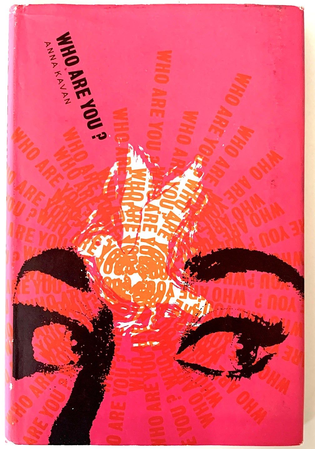
Lowestoft, Suffolk: Scorpion Press, 1963. First edition. 117 pp. Black cloth, spine lettered in gilt, with the dust jacket. Slight rubbing to the head and tail of the jacket spine and corners, rear jacket panel a little toned. Overall clean and bright, nicer than usually seen. Cover designed by Laurence Edwards. Kavan's penultimate novel, like all her work, hallucinatory and bleak. This first edition is extremely uncommon. Her publisher Peter Owen rejected the book as being too short, and it was published by the tiny Scorpion Press, which usually published poetry.
Offered by Triolet Rare Books.
A Supposedly Fun Thing I'll Never Do Again (Signed)
by Wallace, David Foster

Boston: Little, Brown. 1997. First Edition; First Printing. Hardcover. Very good+ with slight abrasion on the top 2" of the spine and along the bottom front board and light spotting to top of text block, in near fine dust jacket with slight wear at the head of the spine. Signed by the author on the title page. ; 8vo 8" - 9" tall; 353 pp .
Offered by Beasley Books.
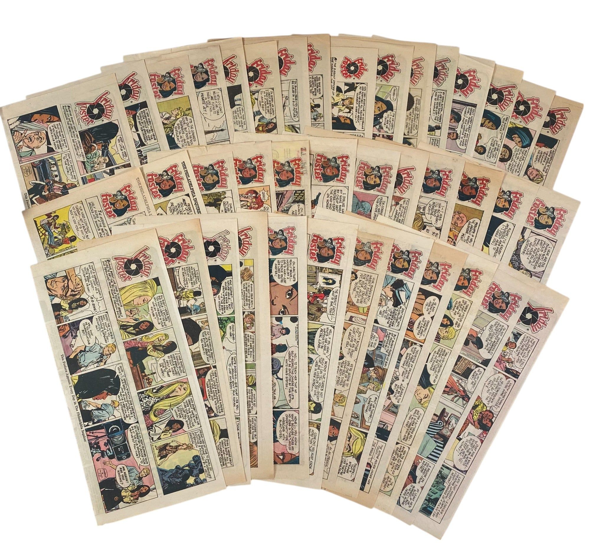
First Black female led national comic strip Friday Foster, archive of 40 full-color Sunday comic strips, 1970-1972. Originally printed in The Philadelphia Inquirer. Created by writer Jim Lawrence and illustrated by Jorge Longarón, Friday Foster was the first nationally syndicated comic strip to feature a Black woman as its protagonist. This run captures the cultural and political undertones of the early 1970s, exploring themes of race, gender, and professional ambition through the lens of Friday, a sharp, stylish African American photojournalist navigating the fashion world and broader urban life. The strips are visually rich with mod-era style, Afrocentric fashion, and an emotionally expressive rendering of interpersonal relationships, centering a rare Black female lead in mass media during a moment of increasing racial representation. The comic would later be adapted into a 1975 Blaxploitation film starring Pam Grier as Friday Foster.
Each strip features narrative-driven vignettes chronicling Friday’s professional and personal entanglements, often placing her in socially charged situations: from escorting an endangered child to safety, to confronting exploitative modeling agents, to resisting media sensationalism, to engaging with diverse characters reflecting Black, Latinx, and Asian American experiences. These strips are emblematic of the strip’s bold engagement with contemporary identity politics and groundbreaking contribution to racial and gender representation in 20th-century syndicated media. Light toning to edges typical of period newsprint; some pages with small (under 1") closed tears and one exhibiting discoloration affecting comic. Overall bright, well preserved and in very good condition. An exceptional archive showcasing one of the first national representations of a Black female protagonist in comics.
Offered by Max Rambod, Inc.
Original ink and colored wash design for three-piece silver tea service
by Benda, George R.
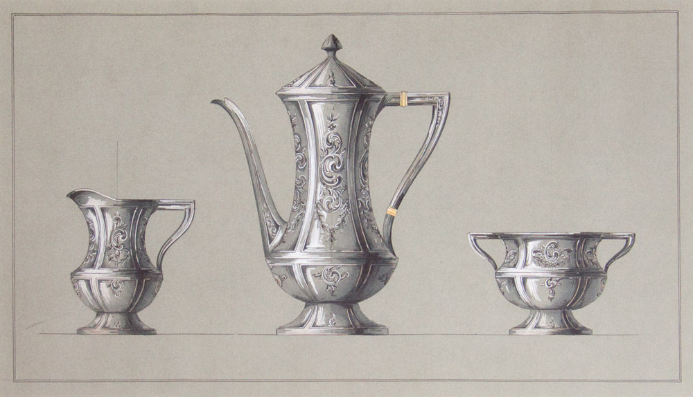
New York, 1890. 1 vols. Image 12 x 21 inches; matted and framed to 19 x 28 inches overall. Framed and glazed. 1 vols. Image 12 x 21 inches; matted and framed to 19 x 28 inches overall. George R. Benda worked in New York at the end of the 19th century; he specialized in designs in silver, many for the noted firm of Black, Starr & Frost - Gorham, for whom he may have made this elegant rendering.
Offered by James Cummins Bookseller.
Western Wheel Works Bicycle Manufacturers, Chicago U.S.A.
by Western Wheel Works
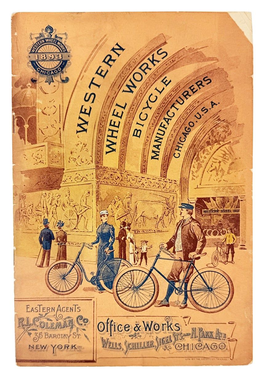
Chicago: Western Wheel Works / Office & Works Wells, Schiller, Siegel Sts & N. Park Ave, 1893. Very Good. Chicago: Western Wheel Works / Office & Works Wells, Schiller, Siegel Sts & N. Park Ave, 1893. First Edition. Tall octavo. 32pp. Illustrations throughout. Illustrated stapled wraps. Chips and creasing to edges with a few tears; general smudging. Split at top of front wrap along spine; brief loss near top staple, binding else sound and interior unmarked. Includes illustrations and descriptions for the Blackhawk, Escort, and Juno models, among others; final 10 pages full of descriptions and illustrations for parts for each model. A neat little production published the same year as the Chicago World's Fair. We locate a single holding in OCLC at the University of Michigan, and later catalogs specifically for "Crescent Bicycles" from the same firm are only slightly more plentiful.
Offered by Capitol Hill Books.
by WILSON, Harry Leon
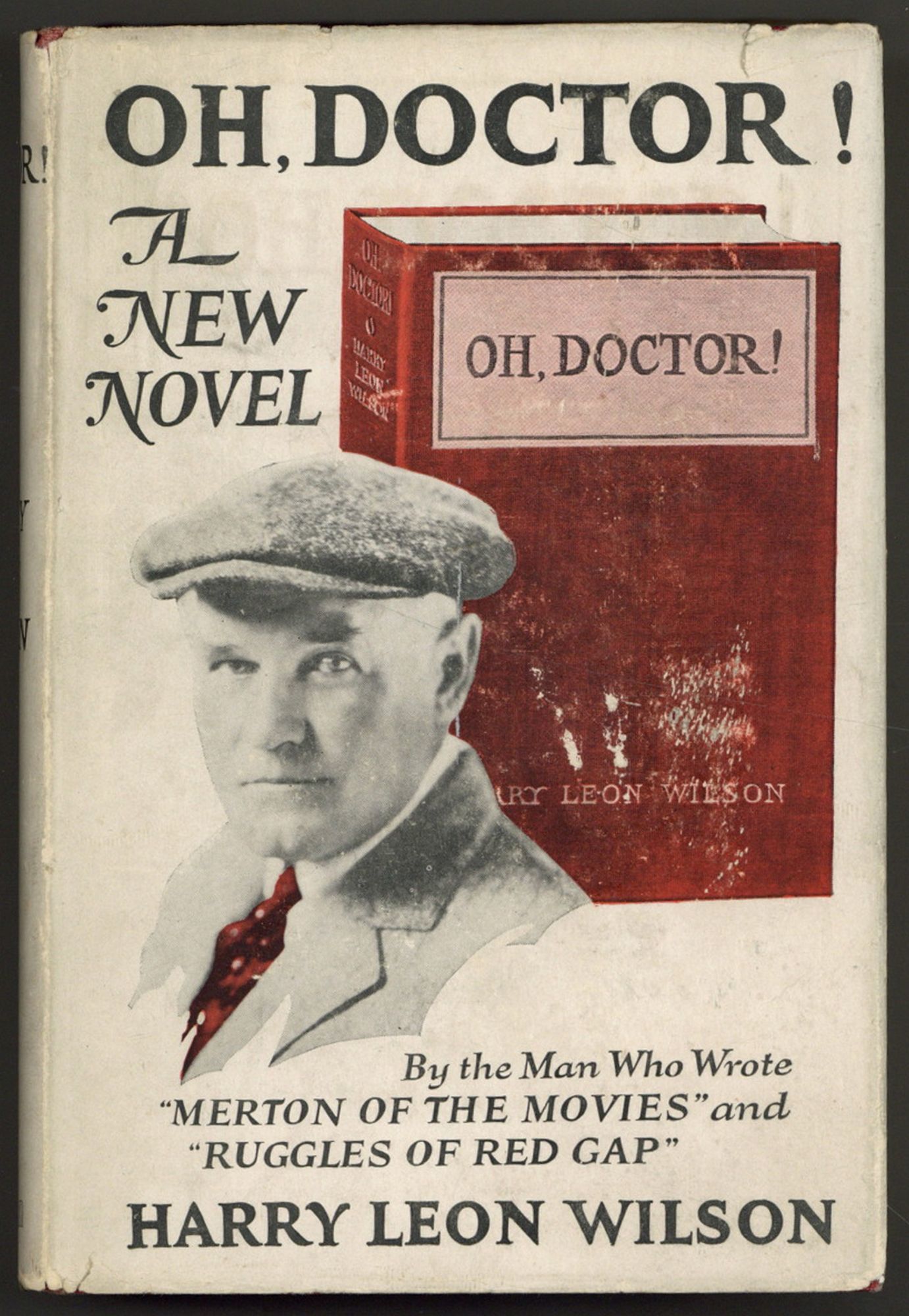
New York: Cosmopolitan, 1923. Hardcover. Near Fine/Very Good. First edition. Near fine in about very good dust jacket with rubbing and some creased tears on the rear panel. Basis for two films: a 1925 silent version directed by Harry A. Pollard and featuring Reginald Denny and Mary Astor; and a 1937 version directed by Ray McCarey and featuring Edward Everett Horton, Donrue Leighton, and Eve Arden. Scarce in jacket.
Offered by Between the Covers Rare Books.
The Art of Railroading or the Technique of Modern Transportation. (8 volumes)
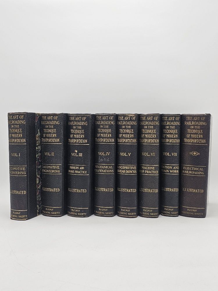
Chicago.: Railway Publications Society., 1906 - 1908. Original half black leather over marbled boards, gilt spine titles, marbled edges.. Very good, light shelfwear, blacked-out numbers on the upper corner of the title pages, folding frontis of volume 1 detached but present.. 22x15x39 cm.. A scarce monumental treatise on railroading at the end of the golden age of American railroads. Heavy set, may require extra shipping. weight: 20.5 lb. Numerous illustrations, many of which are fold-outs.
Offered by Lee Johnson's Zephyr Books.
East of the Sun, West of the Moon
by [Asbjornsen, Peter Christen] and [Moe, Jorgen Engebretsen]; Nielsen, Kay [Illustrations]
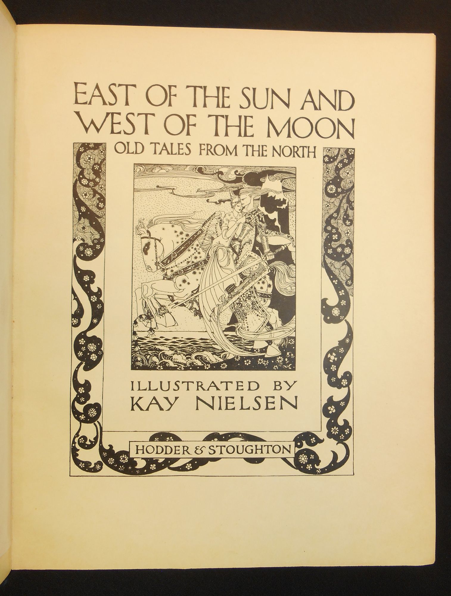
[London]: Hodder & Stoughton, 1914. First Edition. Hardcover. Very good. Nielsen, Kay. First trade edition, quarto size, 207 pp. Kay Rasmus Nielsen (1886-1957), was born in Denmark hearing the traditional Norse fairy tales related by his mother, studied art in Paris, and moved to London in1911. His artwork brought immediate critical acclaim with his first illustrated book, "In Powder and Crinoline" being published in 1913.
However, it was this work, "East of the Sun, West of the Moon", which, "y general consent, [is his] most spectacular and celebrated." One of his admirers, Martin Birnbaum, wrote of this book: "His most intricate inventions never seem laboured. Controlled in a measure by Norse ornamental traditions, he reaches an absolute equality with the poetical text..." (Dalby, p. 90).
Nielsen's style was heavily influenced by Japanese art, and his artwork "unite[s] strong linearity with delicate colouring. For example, the heroine of 'Prince Lindworm'...kneels in a perfect arc of physiologically impossible grace before a tree whose weeping branches echo her curves." (Zipes, p. 341).
Sadly, Nielsen's later years were marked with poverty, as his artwork was no longer in demand after WWII. If only he could know what a great gift his talents have given, and what joy his art has brought to so many.
DESCRIPTION: Bound in dark blue cloth over boards, gilt lettering and elaborate designs on the front panel and spine, richly decorated endpapers by Nielsen in black and gold, illustrated and bordered title page in black, lettered tissue-guarded frontispiece one of twenty-five full colour illustrations bound in throughout, each tipped at the gutter edge onto heavy paper with borders of black and gold, in addition to the colour illustrations there are numerous black-and-white line in-text line drawings and decorations on every page, with each story opening with a three-line initial capital; binding is quarto size (11 3/8" by 9"), pagination: [i, title page with blank verso] [1-8] 9-205 [206].
CONDITION: Very good overall, the boards clean, we had a professional (name available upon request) restore the joints and some damage to the spine and corners, the volume is now sturdily bound, the hinges are solid, the inside is clean other than two leaves with some offsetting from something laid in at some point in the past (not affecting any illustrations), and the sole prior owner marking we see a name lightly written at the top of the front free endpaper; the front board slightly bowed and some soil on the bottom edge of the text block. Overall a near fine interior with a good, but now sturdy, binding.
Offered by Swan's Fine Books.
View all new listings on abaa.org...
Browse recent catalogs of rare books and print ephemera from ABAA members...
Please note, all items are unique, so if a link takes you to a blank page, the book has been sold!