

Browse the latest catalogs, newsletters, and e-lists of rare books, fine bindings, incunabula, print ephemera, and much more from the members of the ABAA below. (Also includes podcasts, blog posts, and other digital formats.)
*New* indicates any catalogs brought to our attention since early-May 2025.
AARDVARK BOOKS/EZRA TISHMAN BOOK APPRAISALS
ANTIPODEAN BOOKS, MAPS, PRINTS
- E-list #44 ~ W.W.I., Americana, Australia, Photographs, Maps, Ephemera
- E-list #43 ~ Antipodean Books at the Brooklyn Virtual Book Fair
- Electronic List 148: A Holiday Selection
- Artists' Books and Exhibition Catalogues: Electronic List 146
- Charles Sanders Peirce Catalog
- EVOLVING HISTORY of IDEAS (New York Book Fair)
Featured item:
Grant, U[lysses]. S. (1822-1885)
Personal Memoirs of U. S. Grant
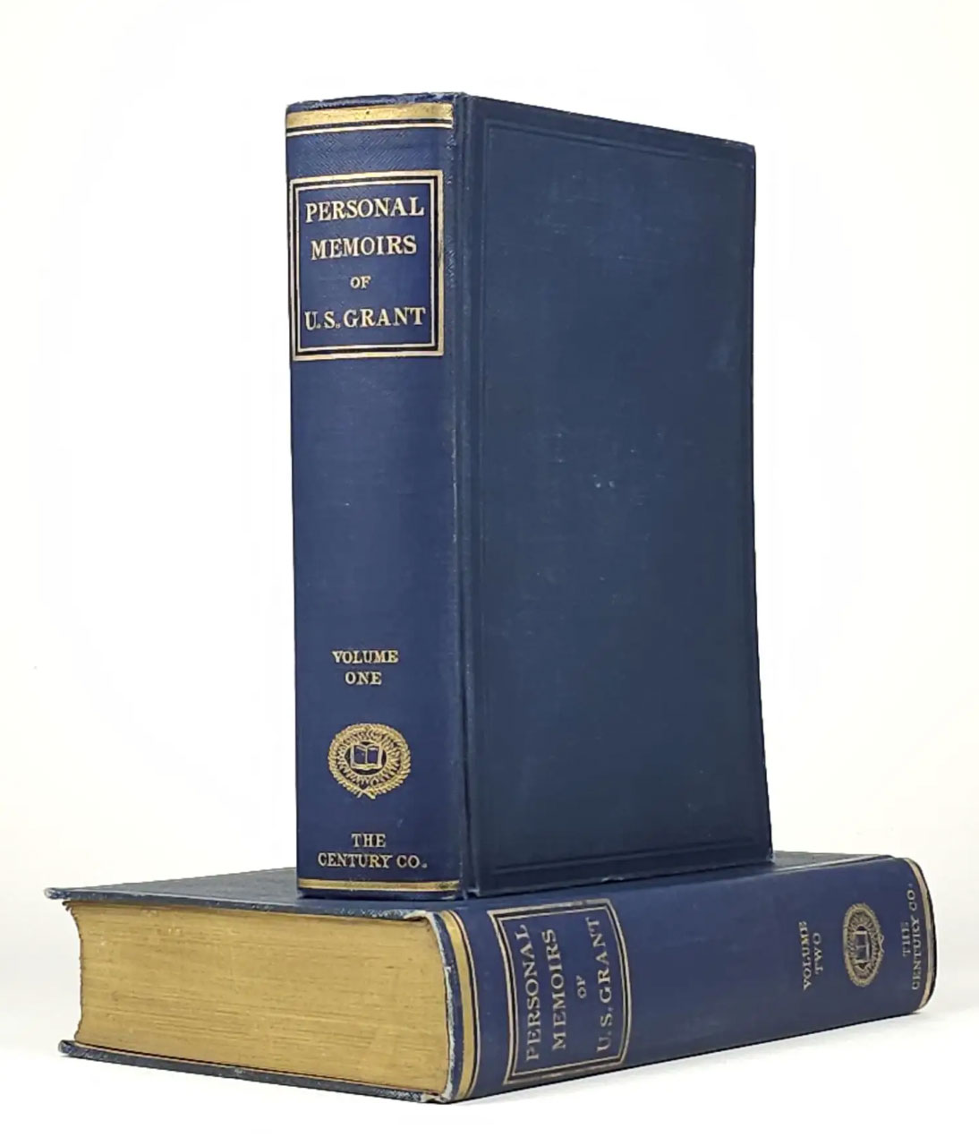
New York: The Century Co., 1895. Expanded Edition. Black & White Engraved Plates, Maps, Facsimiles. Cloth over boards. Octavos. Bound in dark blue cloth over boards with spines titled in gilt, top edges gilt. Minor extremity wear, some light surface abrasions to boards. Hinges sound. Handsome contemporaneous bookplate of William Henry French in each volume. Attractive set.
The greatest American military memoir, as written by the financially ruined Grant in a race with death. This is the first printing of the second edition, expanded and augmented under the supervision of Grant's son.
Offered by Back Creek Books and found in "E-list #60."
Featured item:
BRADFORD, Perry
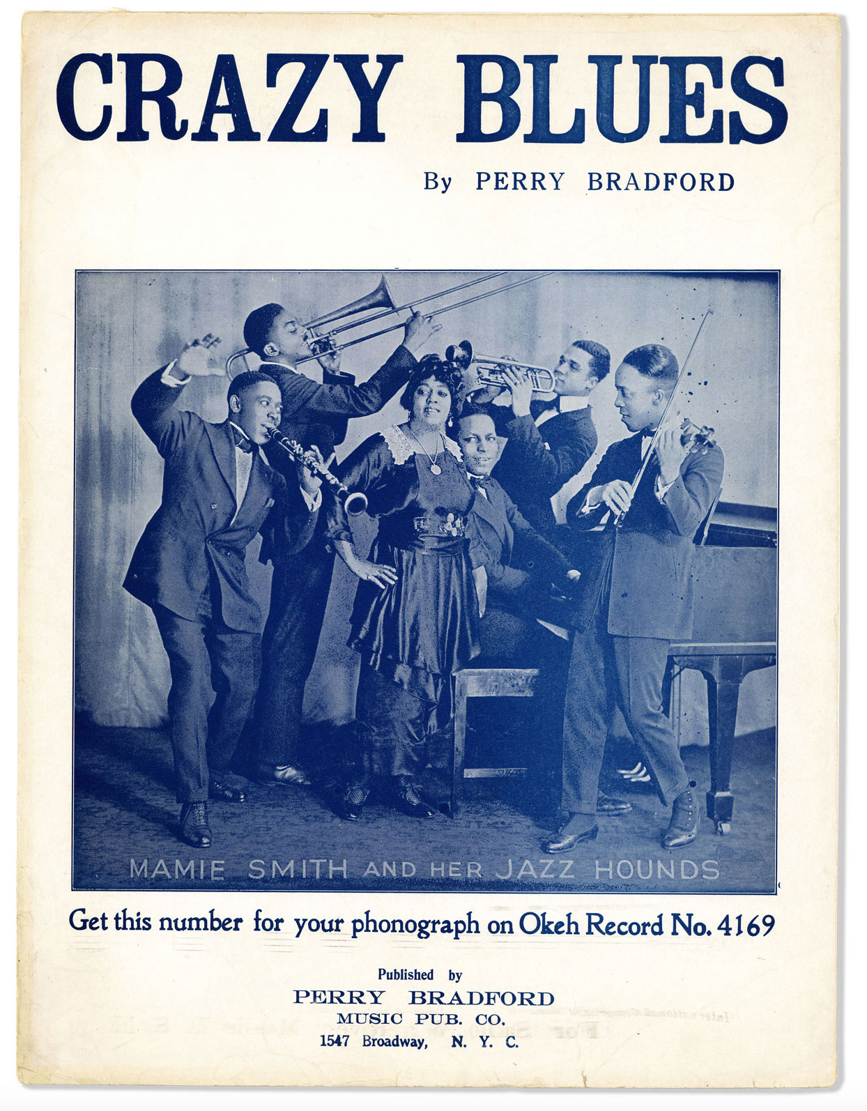
New York: Perry Bradford Music Pub. Co., 1920. First Edition. Quarto (31cm); photo-illustrated wrappers; 6pp. Light wear and handling, a few tiny tears to extremities, faint stain to lower rear wrapper, and two tiny tape squares along upper margin of rear wrapper; Very Good+.
Well-preserved sheet music for African-American composer and bandleader Perry Bradford's Crazy Blues, which was sung by and popularized by blues singer Mamie Smith. Front wrapper reproduces a large photograph of Smith, backed by her band, the Jazz Hounds. The relationship between Bradford and Smith was significant; in addition to functioning as her musical director, in 1920 he was responsible for convincing Fred Hager of Okeh Records to record her, breaking a significant color barrier and making her the first African-American blues singer to appear on record. Bradford and Smith recorded Crazy Blues in a New York studio on August 10, 1920. "A boisterous cry of outrage by a woman driven mad by mistreatment, the song spoke with urgency and fire to Black listeners across the country who had been ravaged by the abuses of race-hate groups, the police and military forces the preceeding year - the notorious "Red Summer" of 1919...As a record, something made for private listening in the home, "Crazy Blues" was able to say things rarely heard in public performances. Seemingly a song about a woman whose man has left her, it reveals itself, on close listening, to be a song about a woman moved to kill her abusive partner. As a work of blues, it used the language of domestic strife to tell a story of violence and subjugation that Black Americans also knew outside the home, in a world of white oppression" (Hajdu, David. "A Song That Changed Music Forever." The New York Times, Aug.8, 2020). While there had been blues recordings prior to Crazy Blues, most of them instrumental and nearly all played by white musicians, Hajdu notes that Bradford and Smith's recording became "a hit record of unmatched proportions and profound impact," selling 75,000 copies within a month of its release and a reported 2 million over time, and establishing the blues as a popular art form. OCLC notes 8 holdings (NYPL, U.Louisville, Tulane, Cleveland Public, Middle Tennessee State, U.Illinois, U.Michigan, Brigham Young).
Offered by Lorne Bair Rare Books and found in "April 2025."
W. C. BAKER RARE BOOKS & EPHEMERA
- May 2025 *New*
- Ephemera, March 2025
- eList 245: Art & Illustration *New*
- eList 244: Mother's Day *New*
Featured item:
Wescott, Glenway
A Calendar of Saints for Unbelievers [Association Copy Artist Inscribed to Edith Sitwell]

Haarlem, Holland, Harrison of Paris, 1932. Illustrations by Pavel Tchelitchew. Brown-red half-leather strap with two gold-embossed spine plates. Top edge gilt. Leather spine label. A limited edition of several styles.
This is out of sequence signed ‘not for sale’ of 40 copies on Pannekoek white pure rag paper. Signed with inscription by the author and the artist to Edith Sitwell. Tenth publication with Harrison of Paris. Designed by Wescott's partner Monroe Wheeler and is the first one printed in the Krimpen's twelve-point Romanée type. Illustrated with 12 signs of the Zodiac and tailpiece by Pavel Tchelitchew; printed by Joh. Enschedé en Zonen, Haarlem
The bindings are tight and square. Text is clean; light, even age-toning. Moderate shelf handling wear, the lower edge with rubbing. A former owner’s notes on the front pastedown in pencil. Very Good / No Dust Jacket, As Issued.
Glenway Wescott, known for his introspective and poetic prose, crafts a collection that reimagines saints' lives through a secular lens. Each narrative challenges traditional hagiographies, offering humanist perspectives on faith, doubt, and the quest for meaning. The stories resonate with existential themes, exploring moral dilemmas and the complexities of spirituality in a modern context.
Harrison of Paris, renowned for its meticulous craftsmanship, enhances Wescott's narratives with bespoke bindings, exquisite typography, and evocative illustrations. This collaboration between author and press results in a book that not only engages intellectually but also captivates aesthetically. It appeals to collectors of literary rarities and those interested in the intersection of literature and visual art. [Adapted from Reviews]
Pavel Tchelitchew (1898–1957) was a Russian-born artist whose work traversed multiple styles and disciplines, leaving an indelible mark on 20th-century art. His significance lies in his innovative approach to surrealism, his integration of anatomical studies into art, and his contributions to stage design.
Edith Sitwell (1887–1964) was a prominent English poet and writer, known for her distinctive voice in modernist literature. Coming from an aristocratic family, she was one of the most outspoken and unconventional literary figures of her time. Sitwell’s poetry, marked by its bold use of language and rhythm, often explored themes of individualism, modernity, and the impact of war.
Offered by Blind Horse Books and found in "New Fine Press Listings from the Monroe Wheeler Press / Harrison of Paris."
BLUEMANGO BOOKS AND MANUSCRIPTS
- Brattlecast #207: The Changing Book Business (Podcast)
- Brattlecast #206: More About Bookplates (Podcast)
Featured item:
218 vols. Various sizes, generally 12mo to 4to. Nearly all in the publisher’s deluxe embossed morocco gilt bindings. Condition is overall very good to fine, with specific defects noted in the detailed inventory of the collection. An important collection of American gift books & annuals, assembled over many decades with an eye for condition and copies in their deluxe publisher’s bindings.
The annual gift book trend, imported from Europe in the 1820s, flourished in the young American republic, showcasing its best writ - ers, including many female authors, and representing the pinnacle of bookmaking at the time. These books, which published Ameri - can short fiction and poetry embellished with fine engravings and chromolithographs, and housed within elaborate embossed morocco bindings, were meant to be displayed in the parlor as objects of middle-class aspirational culture. They were generally published in the late summer or fall, advertised as Christmas or New Year’s gifts, and often contained blank presentation leaves that could be filled in by the purchaser. Nearly all of the books in this collection that are inscribed with presentation inscriptions have been given to women — attesting to the overwhelming female audience for gift books.
Gift books were a significant means of support for many American authors, and this collection includes contributions (some of which are first appearances) by Poe, Hawthorne, Longfellow, Emerson, and scores of other writers. Women writers and editors were also key to the gift book phenomenon, with contributions by Hale, Sigourney, Leslie, Stowe, Percival and others. In addition, the gift book rep - resents an important contribution to American book arts and the development of deluxe trade bindings and book illustration.
The popularity of the gift book coincided with increased literacy and developments in steam-powered presses and stereotyping that lowered printing costs, enabling a wider reading public. The rise of a middle class readership that self-consciously aspired to a taste for arts and letters that it associated with wealth and higher social status fueled demand for gift books. The gift book also showcased American arts and letters when American culture was defining itself against accusations of crudity or outright nonexistence when compared to its European counterparts. “Here were books ideally suited to an aspiring middle class. They appealed to the eye and the heart rather than to the mind; they were handsome and costly; they were ‘artistic’ and ‘refined.’ They met a demand for ‘culture’ and showed the purchaser that his country could produce — and would support — its own painters, engravers, and authors. American presses could no less than the British turn out fine typography finely bound. America could no less than Europe understand matters beyond the making of money” (Thompson, American Literary Annuals and Gift Books, p. 4).
Gift books were often called “ladies’ books” and, judging from the inscriptions in this collection, the recipient of the gift book was nearly always a female. Content was often highly sentimental and romantic, set in exotic, far-off-lands, and concerning the imaginary and the ideal. The gift book trend did not survive the turn to realism in the mid century, though the Lily of the Valley tried to incorporate discussion of current issues (temperance, abolition, etc). “When political and social inquiry began to spread, the romantic enthusiasm expressed by the annuals was on the wane” (Thompson, p. 5). Gift books further suffered from the rise of monthly magazines, which siphoned off more readers.
Offered by Bull's Head Rare Books and found in "Catalogue Four."
ANDREW CAHAN, BOOKSELLER, LTD.
- From the library of John Henry Nash -- list available on request from info@carpediemfinebooks.com...
- New Arrivals
BRIAN CASSIDY, BOOKSELLER AT TYPE PUNCH MATRIX
- There She Blows *New*
- Firsts London *New*
- E-list: Photographic Archives, Latin-Americana, African-Americana, Lincoln Conspirators, American Indian History, and More -- Joint catalog with Auger Down Books
DE SIMONE COMPANY, BOOKSELLERS
Featured item:
MARTUSCELLI, PASQUALE. Trattato di calligrafia: analiticamente esposto, e dedicato ai suoi cari allievi.
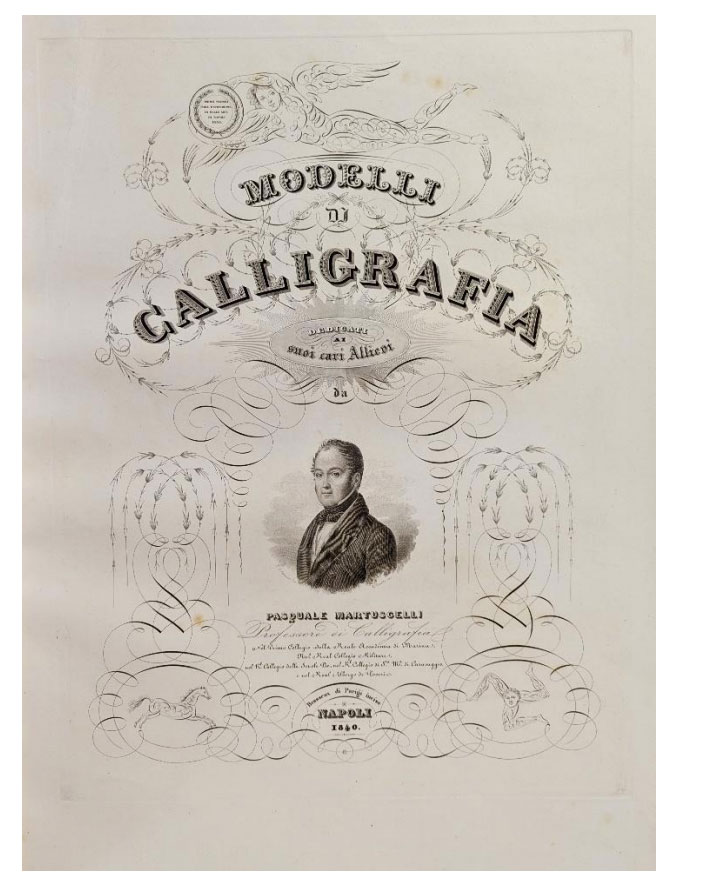
Napoli: Dalla Stamperia e Cartiera del Fibreno, 1840. Large folio. 530 x 365 mm., [21 x 14 ¼ inches]. 27pp. of text followed by 25 full-page engraved plates. Bound in recent half calf and corners, marbled paper boards; some foxing to the paper stock and binding with a moisture stain on upper board. With faults a very good copy of a rare calligraphic manual.
First edition. Pasquale Martuscelli was a member of the faculty at the Royal Naval Academy in Naples and member of a number of military societies associated with the Royal College of S. Caravaggio. In his De Simone Company, Booksellers Trattato di calligrafia, Martuscelli offers a manual to learn the traditional methods and styles of handwriting, beginning with a discussion of the tools of the calligraphic trade, followed by lessons in design forms including the minuscule, majuscule, bastarda, cursive, and rotonda. The twenty-five plates are engraved by the notable French firm Brasseaux, established in Paris in 1827. The firm was owned and operated by two brothers, both expert in field of engraving, part of a family that created engraved medals, stamps, and stationery for Louis Phillippe and other members of the noble families of Paris.
Martuscelli’s manual and the one by Giuseppe Palermo are excellent examples of the emphasis that the Royal Naval Academy in Naples place on clear and well designed written communication. These large calligraphic manuals one focusing on traditional forms and the second on styles reflecting 19th century taste are both rare.
Offered by De Simone Company and found in "List 64: Calligraphy."
- New Arrivals (May 12, 2025) *New*
- Shaker Books, Ephemera and Photography
EDITIO ALTERA RARE BOOKS & MANUSCRIPTS
- Comic collection of William "Gatz" Hjortsberg -- Details available upon request from info@elkriverbooks.com...
- Highlights from the ABAA Virtual Book Fair
RODGER FRIEDMAN RARE BOOK STUDIO
Featured item:
Darwin, Charles. The descent of man, and selection in relation to sex.

London: John Murray, 1871. 2 volumes octavo (20 cm). Original green cloth. Spine cocked somewhat on volume 1. Both volumes well-read, but quite good. Owner's name in pencil on title page of volume 1. References: Norman 599; Garrison-Morton 170. Corrections to the text in volume 1 mark this printing as the second issue of the first edition. Volume 2 is the first restriking (“seventh thousand.”) It is noted that the word "evolution" occurs here on page 2 of volume 1 for the first time in any of Darwin’s works.
Offered by Rodger Friedman Rare Book Studio and found in "Darwin."
Featured item:
Women’s Center Newsletter, Summer 1973

New York: Women’s Liberation Center of New York, 1973. Offset. Single leaf folded to form [4]pp. 8 1/2 x 11 in. Three small tears to edges, slight loss to bottom right corner; very good.
Early flyer from The Women’s Liberation Center, published just a year after its founding by Lesbian Feminist Liberation and the Lesbian Switchboard.
The Women’s Liberation Center was a key node in the New York women’s and gay liberation movement, housing the offices and meeting space of several important organizations of the period, including Lesbian Feminist Liberation, Women’s Abortion Project, the Lesbian Lifespace Project, Older Women’s Liberation, the Lesbian Switchborad, Radicalesbians Health Collective, and several others over its 15 years in the firehouse. Additionally, the Center hosted frequent programming, including concerts, screenings, workshops, community dinners, and many other public events.
A year before the publication of this newsletter, The Women’s Liberation Center was evicted from a loft on 22nd Street and moved into the firehouse, which housed the Center until 1987. This newsletter details the history of the firehouse, the precarious legal status of the Center’s use of it, the process the Center would have to successfully navigate in order to formalize its use of the firehouse, and an ultimately successful political strategy to win a lease. The newsletter also includes an article on the prevalence of rape in New York City and movement efforts to combat it and support survivors, along with a comic by Carol Sanders.
A scarce document from an important early node of the women’s liberation movement and movement for abortion rights.
Offered by Fugitive Materials and found in "Catalog 2: The Birth of a Gay Network."
- Signal & Noise *New*
- 17th Century Fresh Sheet *New*
Featured item:
London: Printed for Benj. Tooke, 1677. Sm. 4to. (4),179pp. Plus 1 page of publisher’s ads. Illustrated with 6 copper engraved plates (3 are double-page & 1 with an old repair). Modern antiqued boards, paper label on front cover. Title and final leaf a bit browned.
Offered by Mark Funke, Bookseller and found in "17th Century Fresh Sheet."
- OCCASIONAL LIST 22: A Miscellany: Original Art Work; Small Archive of Major English Watercolourist; Interesting Theatrical Pieces; Manuscript Material, Etc., Etc. -- available on request from fgrare@fgrarebooks.com...
Join the ABAA-Public Google Group, a listserv where ABAA members announce select books for sale, share information on their participation in upcoming book fairs, and showcase their recent catalogs!
The ABAA-Public Google Group is a read-only email group, so email traffic is kept to a minimum and only ABAA members can announce books for sale — ensuring all items are in full compliance with our Code of Ethics.
.jpg)
Subscribers to the group can opt to receive emails individually, or have each day’s emails combined into a daily digest to limit the number of emails they receive.
THOMAS A. GOLDWASSER RARE BOOKS
DAVID A. HAMILTON AMERICANA BOOKS
Featured item:
DECAISNE, Joseph (1807-1882)
Le Jardin Fruitier du Muséum, ou Iconographie de Toutes les Espcès et Variétés d'Arbres Fruitiers Cultivés dans cet Établissement avec leur description, leur histoire, leur synonymie
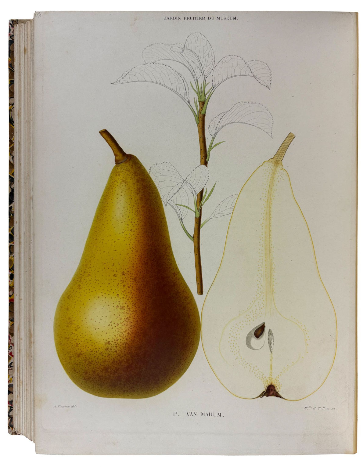
Paris: (Firmin Didot), [1858-]1862-1875. 9 volumes. Folio. (12 1/8 x 9 3/8 inches). 508 plates after Alfred Riocreux, engraved by Mlle. Taillant and P. Picart, including 1 uncoloured engraving and 507 lithographs, 497 with fruit subjects printed in colour and finished by hand, 4 of these double-page. Some light foxing.
Finely bound in early 20th-century, French, quarter light brown morocco and marble paper boards, marble endpapers by F. Saulnier. First and only edition of this fine pomology, one of the greatest of all fruit books.
Joseph Decaisne was a distinguished Belgian-born French botanist renowned for his contributions to horticulture, agronomy, and botanical taxonomy. Trained at the Muséum d'Histoire Naturelle in Paris, Decaisne became head of the museum's Jardin des Plantes and played a crucial role in advancing the study of plant cultivation, particularly fruit-bearing trees. His expertise in systematic botany and plant physiology led to numerous publications, but the present work remains one of his most significant and visually striking works. Le Jardin Fruitier du Muséum is a monumental treatise on the species and varieties of fruit trees cultivated at the Muséum d'Histoire Naturelle in Paris. It serves as both a scientific study and a practical horticultural guide, documenting the morphology, classification, and cultivation of fruit trees in meticulous detail. The work is presented in sections each covering a single species of fruit. The first (and largest) section is on the Pear, or what the author calls the "roi des fruits à pepins." This section, spread over the first six volumes, includes 357 plates. The remaining sections are, in vol.VII and VIII, Peaches (74 plates); Nectarines (13 plates); Plums (12 plates); Apricots (1 plate); and in vol.IX: Strawberries (40 plates, four of which are double-page) and Currents and Gooseberries (11 plates). The plates illustrate individual varieties with their fruit and portions of the foliage. Decaisne provides descriptions of each species, tracing their historical cultivation, geographic distribution, and known synonyms. The numerous plates were by Alfred Riocreux, "the most sensitive and skilful French botanical artist of the period...the Paris counterpart of Walter Hood Fitch" (Blunt). Riocreux's life-size depictions of fruits, branches, and leaves are celebrated for their scientific accuracy and artistic refinement. Bunyard calls the work "magnificent" and writes that it is impossible to speak too highly of the colouring: "the lithographs are magnificent, and no pomological work has approached them for correctness of colouring." The illustrations in Le Jardin Fruitier du Muséum exemplify the golden age of botanical illustration, where the intersection of art and science produced works of both aesthetic beauty and scholarly importance.
Offered by Donald A. Heald Rare Books and found in "The Spring Catalogue."
JONATHAN A. HILL, BOOKSELLER, INC.
- elist 268 New Arrivals in Photography, Art, Poetry, Literature
- elist 267 New Arrivals | Gatsby is 100
- New Acquisitions, April 2025
- Art & Design, February 2025
Featured item:
SP4 MILITARY OFFICER EDWARD JACKSON
US MILITARY in SOUTH KOREA AFRICAN AMERICAN 1978-1988 PHOTO ALBUM LOT

These two photo albums comprise about 240 photographs formerly the property of African American military officer Edward Jackson. One (11 3/4” x 13 1/4”) album possesses 218 photographs across 40 leaves/80 pages. This spiral-bound album is in good shape, and all pages are in use. The second album contains 22 photographs on 8 leaves/13 pages with an additional 6 leaves and 17 pages which are not used. This (11 3/4” x 13”) second album is in less than perfect shape with loose photographs, and loose cover, the front cover is detached and the internal workings of the spine is visible. Items that are not loose are contained behind plastic sheaths. A few photos appear to be missing from the pages of both albums.
During the continued presence of the U.S. Military in South Korea well into the later part of the 20th century, Edward Jackson was a Keypunch Operator at home at the Hunter Army Airfield in Georgia for the Division Material Management Center 24th Infantry , for which he received a letter of appreciation enclosed here. Later, he was a SP4 specialist of the 2nd Army Guard Company (AG CO) in Korea. According to the military’s website this was the U.S. Army’s last permanently forward-stationed division present in South Korea.
In this collection there are photographs of “Bro Jackson”, and fellow black military officers, many of whom are named in captions beside the photographs. Many of these photos have wonderful color backdrops, and one photo is a trick photo or Bro Jackson shown twice in one image. A Korean woman appears in many photos, it is assumed this was Jackson’s lover. Other images include family photographs of youth and elders, etc. Further, many pictures of the military’s recreational baseball teams are pictured here in snapshots. One image of two helicopters flying over a pyramid in Egypt has marker indications and writing. The helicopter cabin is circled pointing to a handwritten note that reads: That’s me! Flying high above Egypt (April 23, 1987)”.
Newspaper clippings include nearly seventeen articles and photographs detailing the assassination of the former President of South Korea Park Chung Hee and his five bodyguards (Oct. 26, 1979). One article details the plot leading up to the assassination, and the following images provide a look into the ceremony and burial sites of the former president.
Three newspaper clipping photographs of the “Battle of New Orleans”, the boxing event televised on September 15th, 1978 showcase the rematch fight between Leon Spinks and Muhammad Ali for the WBA and The Ring Championships. Two of the images are provided with neat handwritten script, one reads: “Leon Spinks appears terrorized as Muhammad Ali slams terrific right to his mug, sending a shower of water from the Champ’s head at close quarters in the New Orleans ring.”.
Offered by House of Mirth Photos and found in "Late Spring 2025."
- Boston Book Fair 2024
- Archive of Hope Savage -- Details available upon request to james@jamesjaffe.com. Institutional inquiries only.
- Short List 35: 19th century Eastern American Newspapers 1803 -1892 from Maine to South Carolina
- Short List of Travel, Exploration, & Tourism in Latin America
- Egyptian Book Artists - Islam Aly *New*
- Book Arts, New Arrivals (May 2025) *New*
JOHN W. KNOTT, JR., BOOKSELLER
- Catalog #74: 100 Rare Books -- with an emphasis on history and military affairs. Please request from mail@kubikbooks.com...
- ABAA 75th Anniversary Virtual Book Fair
- Claude Shannon's Library Catalog 1: Papers he wrote or co-authored
MICHAEL LAIRD RARE BOOKS & MANUSCRIPTS
- Recent Acquisitions: English, American & Continental Law, 1502-1925 (May 13, 2025)
- Law Dictionaries (May 6, 2025)
DAVID M. LESSER, FINE ANTIQUARIAN BOOKS
LIBER ANTIQUUS, EARLY PRINTED BOOKS & MANUSCRIPTS
Featured item:
Development: A Novel. With a Preface by Amy Lowell.
Bryher
![]()
New York: Macmillan, 1920. First American edition. 8vo, xvi, 186 (1)pp; maroon cloth. Lightly shelf-rubbed; edges dusted; very good in the rare dust jacket, dampstained, with a fingernail-sized chip and a small snag to the front panel and cellotape reinforcements on the underside.
The American edition of Bryher's first novel, made up from sheets printed for the London edition with a cancel title page and the additional pages containing Amy Lowell's preface, which did not appear in the first English edition but was included in the second. This copy warmly inscribed and signed by Bryher on the front flyleaf to Chester Page, wryly noting the misspelling of her name on the jacket (it reads "Bryther).
Offered by Locus Solus Rare Books and found in "Bryher - Icon of Queer Modernism."
J. & J. LUBRANO MUSIC ANTIQUARIANS
Featured item:
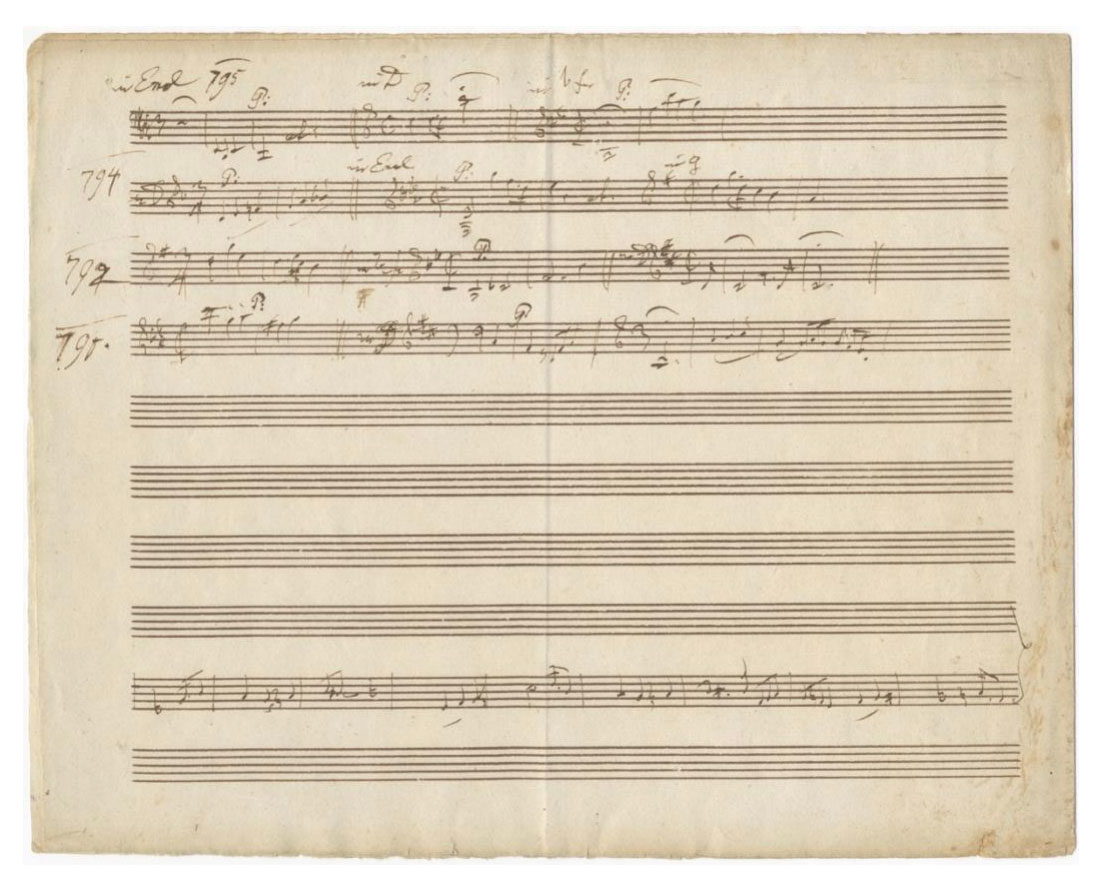
London, 1795. Unsigned. Large oblong quarto (241 x 309 mm.). Notated in dark brown ink on the verso of the second leaf of a bifolium (i.e., page 4) on 10-stave rastrum-ruled paper of British manufacture. Watermark dated 1794. Late spring or early summer, 1795 (see H.C. Robbins Landon: Haydn Chronicle and Works, Volume III, p. 495). With pencilled note in another hand to first page: "Haydn autograph notes of the 12 English Symphonies. Haydn misquotes the 2nd." Very slightly worn, browned, and soiled; minor foxing and very short splits to central fold; vertical crease to center of bifolium; lower edge with several miniscule tears.
In addition to noting the musical incipits, which comprise 25 measures spread out over 4 staves, Haydn identifies the key, time signature, and year in which each 5 symphony was first performed (in noting the performance date of Symphony 97, however, Haydn makes an error and cites 1791 instead of 1792).
The sketch for the piano trio Hob. XV:25 is notated 5 staves below the symphonic incipits and consists of 9 measures of melodic material for the famous third movement.
Provenance: Leo Liepmannssohn auction catalogue, Berlin, 1907, lot 91; Sotheby's auction catalogue, The Westley Manning Collection, London, 12 October 1954, lot 207; J. A. Stargardt, Marburg; Elkin Mathews, London.
The London symphonies were commissioned by the London impresario and violinist Johann Peter Salomon (1745-1815) and composed over the period 1791-95. Salomon was responsible for bringing Haydn to London where he became immensely popular, largely through performances of his music at Salomon's concerts.
"Haydn’s London symphonies (nos. 93-104) crown his career as a symphonic composer. Not only do they outdo the Paris symphonies stylistically, but he produced them in person for rapturous audiences; this interaction stimulated him to ever bolder and more original conceptions. ... The last six [London] symphonies are even more brilliant [than the first six]. ... Haydn’s determination to conquer new territory with each work is palpable." James Webster in Grove Music Online
"The finale of Hob. XV:25 is the famous rondo "in the Gypsies Style." It seems that a composer's most popular works, if not spurious, are at least unusual manifestations of his style, and this rondo fits this characterization. ... Even though this finale was best known during the eighteenth century as a separate piece in many different settings, its impact is best appreciated within the context of this keyboard trio cycle, for the Andante and Poco Adagio (the first and second movements) hardly prepare one for its burst of energy." A. Peter Brown: Joseph Haydn's Keyboard Music Sources and Styles, p. 377.
"... the G major Trio (39) turned out to be Haydn's most popular piano piece, because of the 'Gypsy Rondo' Finale. ... [It] became an enormous favourite, first in England and immediately afterwards on the Continent." Robbins Landon III, pp. 431-32.
A unique and interesting manuscript, being a virtual catalogue of all the London Symphonies and including music from the famous Gypsy Rondo, some of Haydn's best music from his important London period.
Offered by J. & J. Lubrano Music Antiquarians and found in "Catalogue 108: Joseph Haydn."
STUART LUTZ HISTORIC DOCUMENTS
MAIN STREET FINE BOOKS & MANUSCRIPTS
- Latest Acquisitions *New*
- The Underground Press: Black Power, Psychedelia, Counterculture, Social Movements from the 1960s
- Crossing Borders & Breaking Boundaries: A Community Alliance List *New*
- Men & Women Behaving Badly: Historical Materials on the Contradictions of Gender Performance *New*
Featured item:
Collection of original hand-colored fashion sketches pulling inspiration from the Regency Era.

Collection of 10 sheets of original watercolor and ink sketches of womenswear with accompanying descriptions in a single hand. Sheets measure approximately 11x15 inches with some variance based on hand-cutting. Three sheets signed "J.H. Hulme" to the upper
right corner. A unique collection of designs blending Regency and early Victorian era details with practical modern elements, it will be of interest to those researching the role of femme-driven popular culture in shaping fashion.
While we've been unable to identify the specific designer, the sheets' textual content suggests J. H. Hulme's identity as a woman or femme actively engaged in the reading of popular romance novels and in contemplating how women's clothing can be used for expression and function. The midi-length of skirts, the cinched and belted waists, and the lapels and pockets of these designs clearly mark them as mid-late 1930s. But the incorporation of fichus, veiled tophats, equestrian jackets, and the belts carrying watches and fobs all come from the Regency period. The blend is striking, and the explanation for it comes via the handwritten notes alongside the "Cocktail suit inspired by the morning dress worn by The Regency Bucks." This note reveals the simultaneously backward-and-forward looking nature of this collection. The collection was inspired by one of the most popular and groundbreaking romance novels of the moment: The Regency Buck.
"In March 1934, Georgette Heyer began what would become her nineteenth novel. It was also be her first book set in the period of history known as the English Regency...although it lasted only nine years, from 1811 to 1820, the Regency was a dynamic and hugely influential period...Heyer did not know it at the time of writing The Regency Buck, but the novel would mark the beginning of a new genre of historical fiction" (Kloester). The historical romance novel had been born. Heyer had approached her creation with aplomb. "She had found a wealth of inspiring new material relating to the period and was reading widely. Living in Sussex meant she was in easy reach of London by train and would sometimes visit the city," and her library subscription at St. James' gave her access to a "wide ranging collection that yielded a rich crop of Regency related subjects" (Kloester). Critics have noted the rich and accurate space through which her characters moved; and the publisher's sale of the rights in 1935 to allow its serialization in the prestigious Woman's Journal ensured that it was "widely
read by women...and an excellent way to achieve greater exposure to the reading public" (Kloester). Hulme's designs are in some sense fantasy-fulfillment for women and femme readers of The Regency Buck. Some of the sketches are drawn directly from the 19th century -- likely as inspiration and as practice in executing some of the period details in clothing. Most others, though, present her creative blending of 1930s cutting edge design, modern benefits such as buttons, zippers, and machine embroidery with 1810s waistcoats, veils, kid gloves, and corseting. Menswear touches are sometimes cheekily added (such as in the depth or inclusion of pockets, or the suggestion of incorporating men's hats into outfits). Others are more than playful, as they overtly reference the cross-dressing popular among some of the courtesans of the period, and suggesting the use of men's attire as being adaptable to women's eveningwear.
A rich visual and literary collection deserving further study and context.
Offered by Marginalia Rare Books and found in "Crossing Borders and Breaking Boundaries."
- MEXICAN ILLUSTRATED BOOKS. 50 YEARS OF ILLUSTRATED BOOKS PUBLISHED IN MEXICO -- catalog available to institutional buyers by request from mmbooks@comcast.net
- Illustrated Catalog on Carlos Merida (1891–1984) -- Mexican painter, sculptor, writer and graphic designer -- available by request from mmbooks@comcast.net
MARTAYAN LAN RARE BOOKS & MAPS
- A Selection of Twenty Mostly Illustrated Books, 1618 – 1846 *New*
- EXPLORATION & NAVIGATION TO THE AMERICAS & FAR AWAY LANDS
Featured item:
The First Non-Alchemical Chemistry Text. The Copy of Jacob Reinbold Spielmann, Professor of Chemistry and Goethe's Teacher
BEGUIN, Jean; BLAES, Gerard, ed.
Tyrocinium chymicum, Commentario illustratum.

Amsterdam, Caspar Commelinus, 1669.
12mo (13 x 7.5 cm). (18) ff. including engraved title-page, 332 pp., (4) ff., with folding table. Bound in contemporary stiff vellum, somewhat soiled; minor waterstaining towards end. Armorial bookplate of Jacob Reinbold Spielmann (with arms consisting of two dice and a three-leaf clover). Generally very good.
Second augmented edition. Initially published for Beguin’s students, the Tyrocinium quickly turned into one of the 17th century’s most famous and widely published books of chemistry: “the most popular text book of its time” (Ferguson). It is above all a work of practical pharmacology and includes the first mention of acetone, which Beguin calls “the burning spirit of Saturn”. The DSB notes that “[f]or Beguin, chemistry was the art of separating and recombining natural mixed bodies to produce agreeable and safe medicines ... Most of the work is concerned with chemical operations rather than with theory, and Beguin emphasized that the most effective therapy combined Galenic and Paracelsian remedies.”
Jean Beguin (ca. 1550-ca. 1620), a native of Lorraine, sold chemical preparations in Paris and opened a school there for instruction in chemistry, pharmacy, and metallurgy: “He had great reputation as a teacher and was among the first to give practical instruction” (Ferguson). The engraved frontispiece shows Beguin inside his laboratory surrounded by the tools and machines of his trade. A folding table lists chemical operations. This second edition was edited and augmented by the eminent Dutch anatomist and professor of medicine Gerard Blaes (1625-1682). It appeared the same year Blaes received permission to give bedside education from an Amsterdam city hospital, thereby founding Dutch academic medicine.
PROVENANCE: Jacob Reinbold Spielmann (1722-83), professor of chemistry at Strasbourg from 1749, and the chemical teacher of Goethe. Spielmann was one of the last French chemists of note who supported the phlogiston theory. He authored Pharmacopea generalis (J.G. Treuttel, 1783), a concise chemistry textbook which was based on his lectures.
Offered by Martayan Lan Rare Books & Maps and found in "A Selection of Mostly Illustrated Books, 1618-1846."
BRUCE MCKITTRICK RARE BOOKS, INC.
- Louis M. Jason's book Literary (and Other) Celebrity Doodles II is now available. Contact the store at info@mysterypierbooks.com to order...
- Father's Day Gift Offerings
- New York Book Fair 2025
- California Catalog (March 2025)
- Catalog 53 -- featuring Fine Books and Manuscripts from 1641 to 1930, with special emphasis on High Spots in English and American Literature, Fine Bindings, Illustrated Books, 1890’s, Press Books and early, scarce children’s books.
- Catalog 52
- Catalog 69, July 2025 -- by subscription only. Contact oldwestbooks@earthlink.net for details about obtaining a copy. *New*
- Occasional List: Pictorial
- Occasional List (April 2025)
- Before AI: Early Experiments With Computer-Generated Art
- A short list on theology and devotion, 1519-1826
Featured item:
The Srimad Devi Bhagavatam [2 Volumes]

Allahabad: Sudhindra Nath Vasu at the Panini Office, [Ca. 1922]. First editions thus. 2 volumes 10x7," continuously paginated 352 and 353-796pp. Modern Indian binding in slightly different shades of soft red leather tooled in gilt with gray spine labels, speckled page edges, gilt turn ins, and black silk endpapers. The binding technique and cheap paper has caused some cracking at front hinges. Few pencil marks in margins, scattered light foxing. Housed in cloth slipcases.
The first 8 books of the Devi Bhagavatam of Vedavyasa, here translated from the Sanskrit to English for the first time by Swami Vijnanananda. This translation appeared as volume XXVI in the Sacred Books of the Hundus series edited by Major B.D. Basu and published in Allahabad. This canonical text for Devi worshippers promotes Bhakti or devotion towards the divine feminine, one of the earliest Hindu texts to do so.
OCLC cites perhaps 7 physical holdings for this text. From the library of Blanche DeVries and Pierre Bernard.
Offered by Peruse the Stacks and found in "The Birth of Modern Yoga."
PHILLIP J. PIRAGES FINE BOOKS & MEDIEVAL MANUSCRIPTS
PRIMARY SOURCES, UNCHARTED AMERICANA
Featured item:

New Orleans, Louisiana, March 4, 1808. Letterpress funeral invitation, 9 1/2 x 7 in. (24 x 18 cm). English and French text in parallel columns, surrounded by decorative frame. Woodcut devices in margins around frame. Old folds, some ink smudging, docketed on verso. About fine.
John Ward Gurley was struck dead in New Orleans on March 3, 1808, at the tender age of twenty-nine. At the time of his death, he was serving as attorney-general for the newly established Territory of Orleans, as registrar of the land office, and as aide-de-camp to the governor, William C. C. Claiborne, who had appointed the young man--holding a degree from Yale--attorney general four years earlier. By most measures, Gurley’s future in frontier politics, and perhaps even at the national level, seemed preordained. Yet to his constituents in New Orleans, among whom he was as well known for his hot temper and quickness to duel as for his political acumen, it must have come as no surprise when pistol and ball sent him to his grave. Early the next day, his parents and friends issued a hastily printed notice in English and French, inviting guests to the funeral at four that afternoon, adding that “The corpse is deposited at the house of Wm. Simpson, Esq., Dauphin street [son Corps sera exposé chez M. Wm Simpson, rue Dauphine].” This remarkable imprint is surely among the most haunting such notices in the genre, especially for its time and place. It also appears to be the earliest surviving specimen of New Orleans job printing.
Offered by Primary Sources, Uncharted Americana and found in "Catalogue 8" (item #4).
Featured item:
Van Vliet, Claire (lithographs)
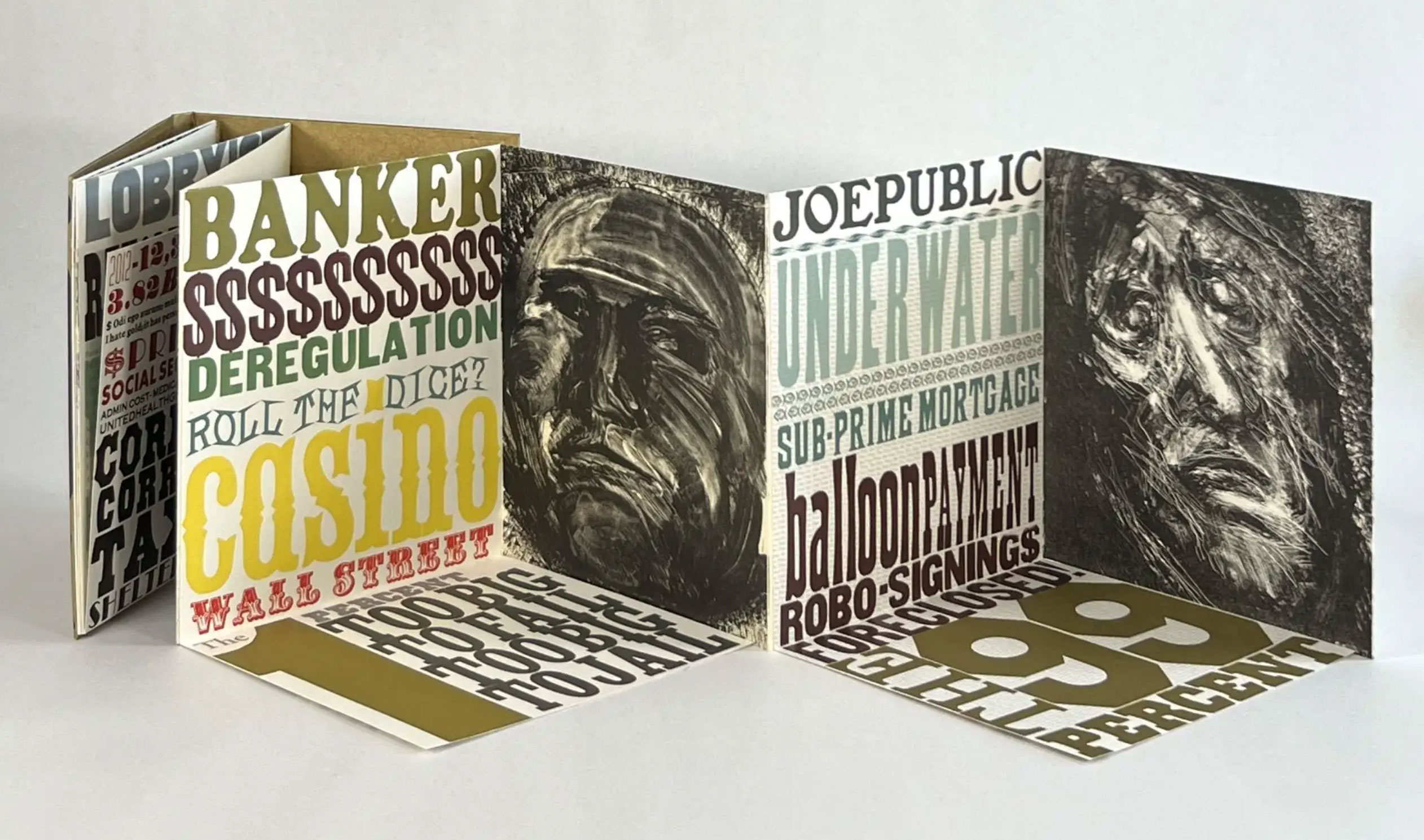
Newark, VT: Janus Press, 2013. Original Wrappers. Fine binding.
6-1/2" x 7." Limited edition, one of 120 copies. Accordion fold with 8 panels, 4 of them are fold-down pages. Each of the four page-spreads include letterpress text in various typefaces and colors which fold-down, expanding the canvas of words, sayings, and accusations (including a catalog of U.S. Senators and Representatives of the 111th Congress who became lobbyists—a list that fills the fold-down page in a small font); these opposite a lithograph by Van Vliet, each lithograph is titled by the top word on the opposite page: Propagandist, Lobbyist, Banker, Joe Public. Bound in gold paper repeated printed with the word "Greed," and all housed in gold slipcase. A fine copy.
In a contemporary newspaper article in the Burlington Free Press, Candace Page relates an interview with Van Vliet: "[She] picks up dummy of GREED, a slim volume that will sit inside a glittery cover of gold paper. It opens like an accordion to display four Van Vliet black-and-white lithographs of distorted faces: A banker, a lobbyist, a newscaster, she says, 'and this one on the end, the sap, John Q. Public, us.'"
Van Vliet continues in the Page interview: "The word 'greed' will be printed multiple times on the cover in heavy, unevenly inked type, as though it were printed contemptuously, by some greedy person with no respect for the written word. The paper is not handmade — that would be too good for the book. Instead it is 'slick, nasty machine-made paper,' she says. The edges of the gold cover will be sharp 'because greed is not a comfortable subject.'" There is a wonderful irony that the lithographs employed in Greed were originally drawn for an edition of Kafka decades before that just weren't quite right for the project. Here, they are perfect!
This is a striking book, a political book, one might say, an angry and defiant book. Van Vliet's politics being informed by the McCarthy era during which she was a student, she admits to having distrusted the powerful ever since. This edition sold out very quickly and is now rare in commerce. A book that was, is, and will always be relevant.
Offered by Michael Pyron, Booksellers and found in "Janus Press, Artist's Books, Design Bindings."
RABELAIS BOOKS ON FOOD & DRINK
RICHARD C. RAMER, OLD & RARE BOOKS
Featured item:
Nicholas Blake

First edition, first printing, inscribed in the year of publication by the author to Nicholas "Nico" Llewelyn Davies, the youngest of the Davies Boys who served as the inspiration for the stories of Peter Pan by J.M. Barrie. From the collection of Larry McMurtry, with his personal bookplate affixed to the front endpaper. The Beast Must Die was the fourth detective novel that Cecil Day-Lewis, poet Laureate of the U.K. and father of actor Daniel Day-Lewis, wrote under the pseudonym of Nicholas Blake. Regarded as the best of these pseudonymous works, the novel has been the basis for multiple adaptations, most recently the 2021 British television series of the same novel.
London: Collins Crime Club, 1938. Publisher's original red cloth, spine lettered in black; pp. (x), 9-284 + [2 ads]. A very good copy in a very good, unclipped dust jacket. Binding remains firm, minimal shelfwear to boards with an area of sunning near spine heel, scattered foxing to fore-edge. Light offsetting to endpapers, else internally quite clean. Jacket shows a bit of general shelfwear with chipping at spine tips, several closed tears at spine heel, light scattered spotting to spine, back panel toned and lightly rubbed. Rare in the dust jacket, even more so signed.
Offered by The Rare Book Sleuth and found in "March New Arrivals."
Featured item:
Margaret Atwood (source, screenplay), Harold Pinter (screenplay)
THE HANDMAID’S TALE [1989] Revised draft film script

New York: Daniel Wilson Productions, [1989]. Vintage original film script, 11 x 8 1⁄2" (28 x 22 cm), 102 pp. The name of Cynthia Greenhill is written on the title page. She worked on a couple of other films in this era, but is not included in this film’s credits. The front page notes that this draft includes revisions from 1/17/[89] on pink paper and revisions from 1/24/[89] on blue paper. This example of the script does incorporate those dated revisions, but the entire script is printed on white paper. Printed wrappers, brad bound, a few pages with light marginal spotting, overall near fine.
The completed film does not represent screenwriter Harold Pinter’s original vision for this adaptation of Margaret Atwood’s dystopian novel. When director Volker Schlöndorff took over the film’s direction (which had originally been assigned to Karel Reisz) and requested rewrites, Pinter suggested he enlist the original author and she, among several other people, were responsible for the final shooting script. However, only Pinter received screen credit for the script in the released film. Thus, this original Harold Pinter screenplay draft—never published—Is of tremendous value to scholars or fans of Pinter and his work. And, of course, any adaptation of Atwood’s feminist classic is of enduring interest.
Offered by Walter Reuben, Inc. and found in "Catalog 55."
ROOTENBERG RARE BOOKS & MANUSCRIPTS
- Books X Decades
- Recent Acquisitions (May 6, 2025)
- List: 150th Anniversary of Mendeleev's Periodic System
- California Book Fair 2019: 130 Items on Science and Medicine is now available on request from scientiabk@gmail.com...
MARC SELVAGGIO, BOOKS & EPHEMERA
MICHAEL R. THOMPSON RARE BOOKS
- E-List #7.25 - African Americana, Women's Rights, Popular Culture and more
- The manuscript archive for Myra Friedman's Janis Joplin, Buried Alive
Featured item:
By Frances Burney, Madame d'Arblay

First edition of this celebrated courtship novel by one of Jane Austen's favorite novelists — including the first appearance of Austen's name in print. Fine.
London: Printed for T. Payne [...] and T. Cadell Jun and W. Davies, 1796. Full title: Camilla: or, a picture of youth. Five octavo volumes, 6.75'' x 4'' each. Early twentieth-century full dark brown morocco by Birdsall, raised bands, spines elaborately stamped in gilt, triple-gilt rules. Gilt dentelles, all edges gilt. With subscriber's list in vol. I including "Miss J. Austen, Steventon." xlviii, 390; [4], 432; [4], 468; [4], 432; [4], 556 pages. Lengthy ink inscription to flyleaf of vol. I; early ink owner inscriptions to title pages.
"She took up a Book; it happened to be a vol: of CAMILLA. She had not Camilla's Youth, & had no intention of having her Distress,—so, she turned from the Drawers of rings & Broches repressed farther solicitation & paid for what she bought." — Austen, in her unfinished novel SANDITON
By 1796, Burney was one of the most famous English writers of the era. When her third novel CAMILLA was published by subscription, Jane Austen signed up. Subscribers paid in advance for a book in order to defray its publication costs or more directly benefit the author, much like our modern crowdsourced projects. And just as in many of today's productions, those who contributed saw their name recorded in print: Austen's name appears as "Miss J. Austen, Steventon" in the list of subscribers included in the first edition.
Austen was eager for another Burney novel, and this one didn't disappoint; in writing a letter to her sister about a new acquaintance, she remarked: "There are two Traits in her Character which are pleasing; namely, she admires CAMILLA, & drinks no cream in her Tea." At around the same time, Austen had just started drafting what would eventually become SENSE AND SENSIBILITY. CAMILLA is a comparative study of two heroines, a format that Austen also used in SENSE AND SENSIBILITY — only one of many examples of how Burney's work influenced Austen's. According to Claire Harman, PRIDE AND PREJUDICE "has so many resonances with CAMILLA as to constitute a form of elaborate homage" (17).
Offered by Type Punch Matrix and found in "Jane Austen's Bookshelf."
- Economic & Political Studies from Charles Goldsmid, Bookseller *New*
- E-List 20, Sales, Marketing & Merchandising in the United States 1886-1973
- Catalogue 328: MEDICAL BOOKS featuring medical history PEDIATRICS & GYNECOLOGY
- Catalogue 327: Science
Featured item:
The Celebrated Jumping Frog of Calaveras County, and other Sketches (Presentation copy)
Mark Twain

New York: C. H. Webb, 1867. First edition. Presentation copy, inscribed on the blank recto of the advertisement leaf: "With compliments of Mark Twain New York, May 9, 1867." The original recipient's name has been torn away (and the advertisement leaf has been repaired with a section from another first edition copy). The novel was published in April 25, 1867, making this one of the earliest presentation copies known. The copy Twain presented to his mother was dated May 1st, and two other copies were dated May 10th (the day Twain gave a lecture at the Brooklyn Athenaeum). This copy last sold in 1991 at Christies in the Chester L. Davis sale. Another early presentation copy for John Stanton (Cory O'Lanus) sold in 2004 for $114,000.
First edition, first issue of Mark Twain’s first book. This copy features the gilt stamp of the leaping frog in the lower left corner, rather than centered on the board; it has all of the points of a first issue as delineated by BAL, including the leaf of ads by the title page and unbroken type on pages 21, 66 and 198. The book has been carefully restored with a new spine (with the original spine laid down) and new endpapers. There is faint dampstaining throughout and the dampstaining to the inscribed leaf matches up with the rest of the book. Pencil notations to verso of final blank, including what looks like a name: C. Wood. And while it is not the only known presentation copy of Jumping Frog, this is undoubtedly one of a handful of copies of the first issue extant and the first to hit the market since the auction result in 2004. Housed in a simple, quarter-leather slipcase with chemise. A Good copy.
Mark Twain, with his account of the jumping frog, produced the most famous tale in California history – if not the history of the American West. This little gem of humor propelled the author and his first book to international prominence. As his publisher, Charles Henry Webb, noted, "By his story of the Frog, he scaled the heights of popularity at a single jump." Twain’s compilation of tales, along with those of Bret Harte, continues to romanticize and popularize the Gold Rush. The story of the lead-loaded frog (named Daniel Webster) made Angels Camp one of the best-known tourist attractions in the gold country. Twain first learned of the story of the jumping frog when he prospected in the vicinity of Jackass Hill in Tuolumne County. On a rainy January day in 1865 Twain and a friend, James Gillis, went into the bar at the Angels Camp Hotel in nearby Calaveras County and heard a gentleman by the name of Ben Coon tell the amusing story of the trained frog. He repeated the story to Artemus Ward, who in turn encouraged him to write it up and send it to Ward’s publisher, Carleton, in New York. The tale’s popularity spread across America and Europe until it was collected in the present volume.
Offered by Whitmore Rare Books and found in "'Tom Sawyer' Presentation Copy and More Twain Treasures."
JOHN WINDLE ANTIQUARIAN BOOKSELLER
- Portland & Environs -- catalogue issued in conjunction with the Rose City Book & Paper Fair
- Dreaming of the Open Road: Automobile Dealer Literature, Catalogue Two
Featured item:
Gilt-paper-porcelain-and-velvet Trinket Box with a Paper Doll Set

S. l.: s. n., n. d. (mid-19th-century [?]). $350.00 Trinket box, housing a paper doll with outfits; box – 4” x 5 ½” x 1”, heavily-embossed gilt paper over card stock, die-cut to show hand-painted porcelain- and velvet- inserts with four miniature cameos; a faint crack to porcelain (not affecting integrity); one of the cameos replaced; remnants of a silk ribbon to inside walls; mild wear to corners; doll - 4 ½” x 1”, with a small "stand" folded at feet; engraved, with hand-colored accents; four dresses (and one just the back half), a scarf, and a head-piece - engraved and hand-colored; small rubbed spot to arm of the doll; outfits with mild wear; overall in very good condition. A stunning box housing a Victorian girl's prized paper doll, the latter obviously cut and lovingly assembled at home, most probably from fashion magazines, or possibly from a commercially-sold kit.
Offered by ZH Books and found in "19th-Century Americana."
--
Remember, you can always browse and download the latest catalogs published by ABAA members on ABAA.org by visiting the following link: https://www.abaa.org/catalog/... (You can also access this page by selecting 'Booksellers' from the top menu, scroll to the bottom of the page to 'Member Catalogs', and click on 'View All'.)

Get to know the members of the ABAA...